Branded motorsport marquee with printed canopy and walls

Designing a Branded Logo Mat for Your Brand

Written by Jonathan Rodgers

A logo mat is seen from above, walked over daily, and dyed into the pile rather than printed on the surface. Here is how to design one for your brand: why bold shapes win, how orientation works, and what the process can and can't hold.

A branded logo mat is different from everything else in the range in two ways: it is read from above rather than straight on, and the design is dyed into the pile rather than printed onto a surface. Both of those shape how you should design it. Here is how to get it right.

Explore Logo Mats Get Design Advice Download a Brochure

A mat sits on the floor and gets looked down at, usually for a moment, as someone walks in. It also gets walked on all day. So the design has to read instantly from above and hold up as a hard-wearing surface, which points to the same conclusion: keep it bold and simple.

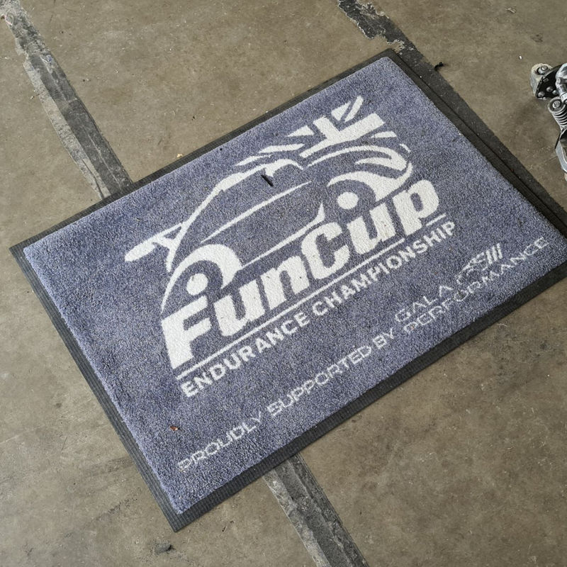
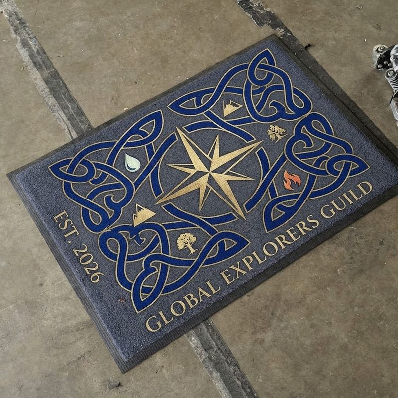
Branded Mat
Branded Mat

Design to Be Seen From Above

A logo mat is viewed from a standing person looking down, at an angle, in passing. That is a very different viewpoint from a banner seen at eye level, and it favours designs that read as a clear shape from overhead.

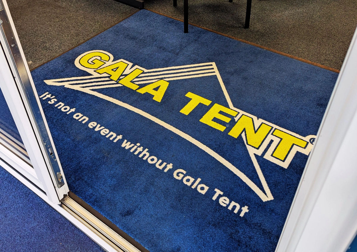
A centred logo on a plain background is the classic and the strongest. It reads instantly from above, it survives the angled view, and it looks deliberate. Busy layouts, small supporting text and fine detail all struggle, because nobody stops to study a mat, they register it in the second it takes to step over it.

Keep it to your logo and, at most, a very short line such as a name or a single word of welcome. A mat is a recognition device, not a place for information.
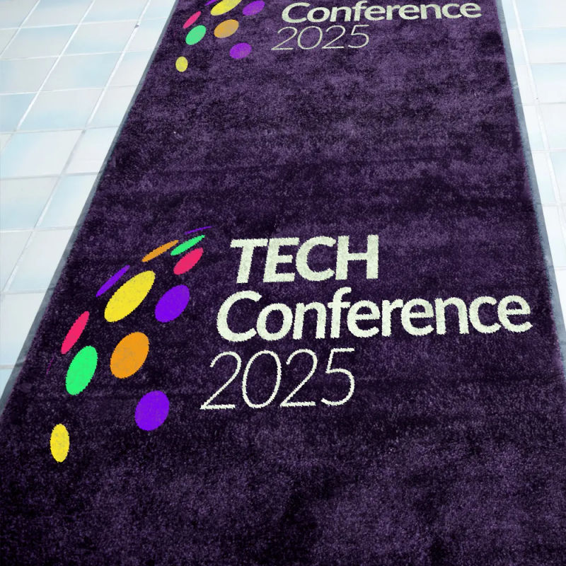
Bold Shapes, Because It's Dyed Into the Pile

This is the key technical point that shapes the design. A logo mat is not printed on a smooth surface, the colour is dye-injected deep into the fibres of the pile. That is what makes it hard-wearing and colourfast, and it is why bold designs work far better than delicate ones.

Solid shapes, strong lines and clear colour blocks reproduce cleanly in pile. Very fine lines, small text, subtle gradients and intricate detail are where the textured surface works against you, because the fibres are a coarser canvas than paper or vinyl. If your logo has very fine elements, a simplified version usually reads better on a mat than the full detailed one.

Use Strong Colour Contrast

Because a mat is textured and seen at an angle, contrast matters even more than usual. A clear difference between your logo and the background colour keeps it sharp from above. Similar tones sitting close together, or a pale logo on a light ground, blur into the pile.

The good news is the process handles strong, saturated colour beautifully and holds it through heavy footfall and cleaning, so this is a product where you use your boldest brand colours with confidence.

Get the Orientation Right

A mat has a viewing direction, and it is worth deciding deliberately. People approach an entrance from a particular direction, so the logo should be oriented to read correctly to someone walking in, not to someone already inside looking back.

Think about which way people come through the door and set the design so it is the right way up for them at the moment they see it. For a mat that is approached from two directions, a centred, symmetrical logo avoids the problem of the design being upside down to half your visitors.

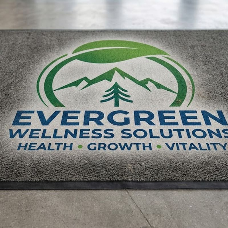
Branded Mat
Branded Mat

Shape It to the Space

Logo mats are made to order in any size and shape, so the design and the outline can work together rather than a logo dropped onto a standard rectangle.

For most entrances a rectangular mat sized to the doorway is right, with the logo centred. Where it suits the brand, a bespoke shape, a mat cut to the outline of your logo, or a circular mat under a central logo, can look considered rather than standard. Size it to the entrance too: a mat that is too small for a wide reception looks lost, and the logo needs enough surrounding space to read as deliberate rather than cramped.

Match It to the Interior

A logo mat is the first branded thing a visitor stands on, so it sets the tone for the space beyond it. It should share the colour and logo treatment of the interior it leads into, your wallpaper, signage or reception branding, so the entrance and the room read as one identity.

Because it is sold outright and built to last for years of use, it is worth designing around your settled brand identity rather than a short-term campaign look. Our guide to what branded logo mats do for your business covers its role in the entrance.

Let the Design Team Help

Send your logo, brand colours, the mat size and shape you want, and the direction people approach from. The in-house team will set the design to read from above, simplify any fine detail that won't hold in the pile, get the orientation right, and proof it before production.

Frequently Asked Questions

What should go on a logo mat?
Your logo, centred, and at most a very short line such as a name or single word. A mat is read from above in a moment, so it works as a recognition device rather than a place for information.
Why do bold designs work better on a logo mat?
The colour is dyed into the textured pile rather than printed on a smooth surface, so solid shapes and strong colour reproduce cleanly while fine lines and small text struggle. A simplified logo often reads better than a highly detailed one.
Which way should the logo face?
Toward the person walking in, so it reads correctly at the moment they approach. For entrances used from both directions, a centred symmetrical logo avoids being upside down to half your visitors.
Can I have a custom shape?
Yes. Mats are made to order in any size and shape, so the outline can suit your logo or space rather than a standard rectangle.
Expert advice from Gala Graphics


Good Morning, how can I assist you today?

Assistance
ExpandAssistance   Alexandria