Branded motorsport marquee with printed canopy and walls

Designing a Printed Table Cover for Your Brand

Written by Jonathan Rodgers

A table cover is branded from the front, read at seated height, and never printed double-sided. Here is how to design one for your brand: where the branding belongs, what the drop and folds hide, and how the fabric changes the layout.
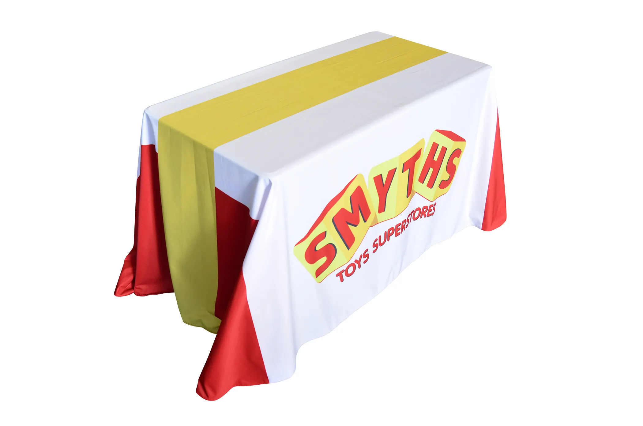
A printed table cover is branding people see below the tabletop, from the front, at close range. That sounds simple, and the design mistakes are simple too: putting the logo where the table hides it, or spreading branding across a surface that folds and drapes. Here is how to design one that works.

Explore Table Covers Get Design Advice Download a Brochure

A table cover has a job most branded products do not: it has to work as fabric, draping over a table with folds and a hanging drop, while also carrying your branding cleanly. The design decisions all come from understanding which parts of the cover people actually see, and which parts the shape hides.

The Front Panel Is Everything

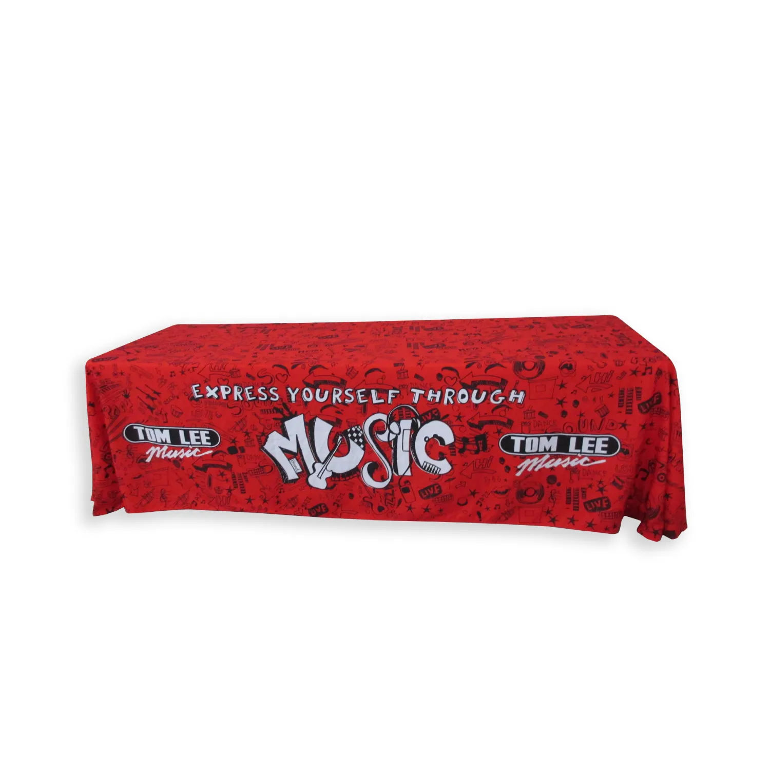
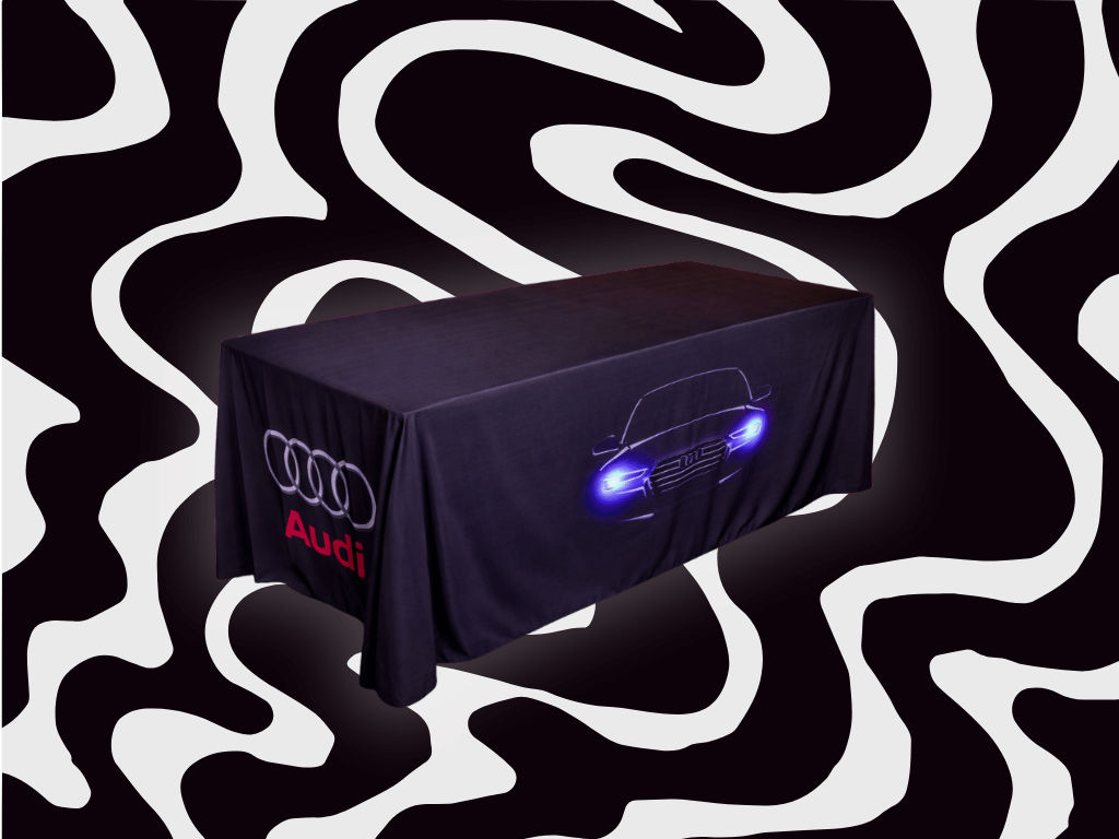
The single most important thing to understand is that a table cover is read from the front, at the vertical drop facing the visitor. That front panel, roughly from the tabletop edge down to knee height, is where your branding has to live.

The tabletop itself is not branding space. It is covered with whatever you are displaying: products, leaflets, a card reader, a laptop. Anything printed on the top is hidden the moment the table is in use. So design the front drop as your billboard and treat the top as a working surface.

Design at Seated Eye Level

People view a table cover from lower than you might expect. Visitors are often seated, bending to look, or standing back a little, so the branding is seen at or below waist height rather than face on.

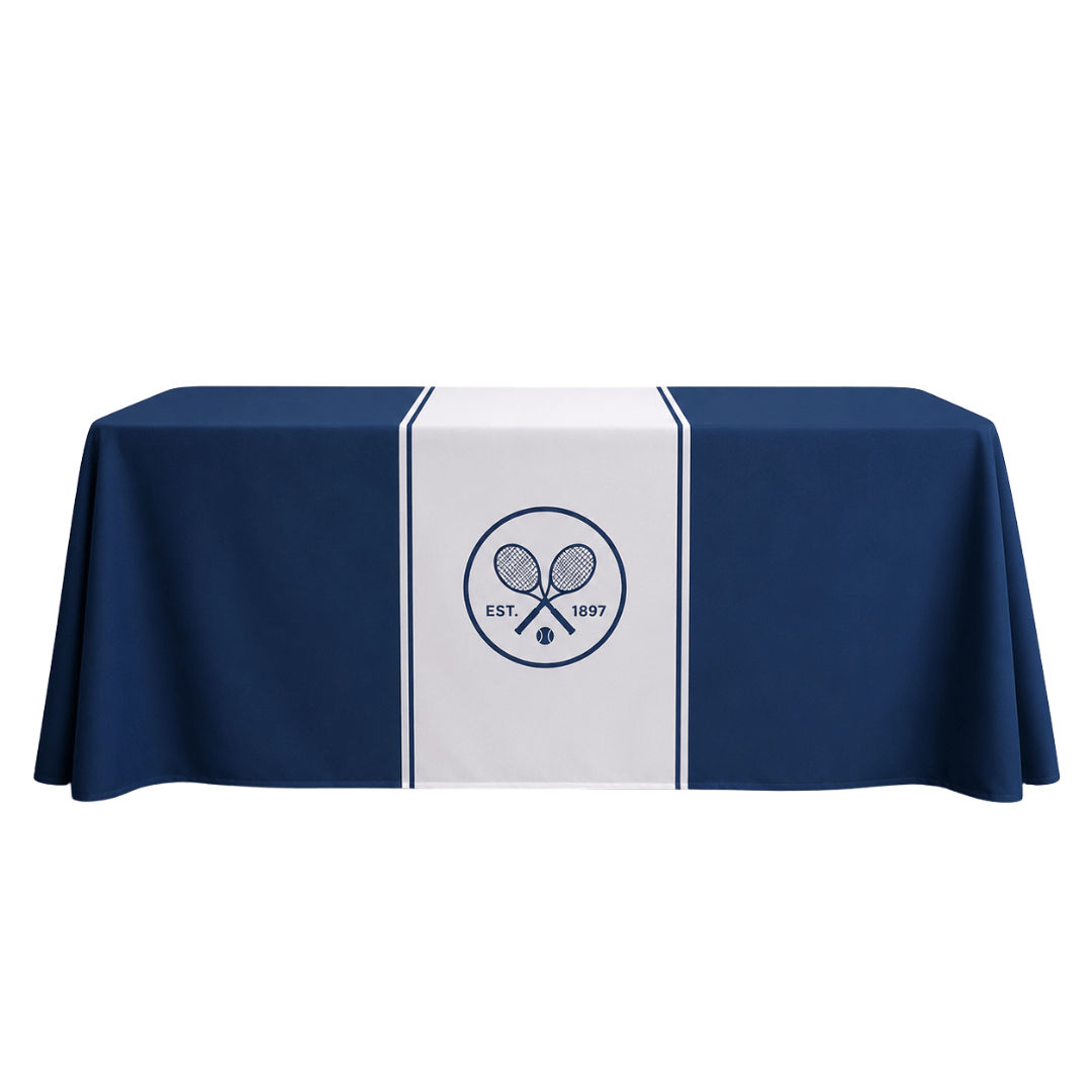
Keep your logo and main message in the upper portion of the front drop, just below the table edge, where it sits highest and is least likely to be blocked. The lower part of the drop is closer to the floor, more likely to be hidden by chairs, bags, feet and anything stored underneath, so it is the weakest space. Centre your identity high on the drop, not in the middle of the fabric.

It Never Prints Double-Sided

This is a genuine constraint worth designing around. A table cover is a single-sided print: the material has very low show-through, so there is no reverse image, and only the side facing out carries your artwork.

In practice that means you design for one primary viewing direction, the front. If your stand is arranged so people approach from more than one side, plan which side is the front and accept that the others show plain fabric or the drape of the material. It also means you should not rely on the cover to brand the back of a table that is seen from behind, that is a job for a banner or a backdrop instead.

Design for Fabric, Not a Flat Panel

A table cover is cloth. It drapes, it has corners that fold, and the front is not a rigid flat billboard. That changes how artwork behaves compared with a banner.

Keep critical elements, your logo and key words, in the centre of the front panel, away from the corners and edges where the fabric folds and gathers. A logo placed near a corner can end up bent around the fold or partly hidden in the drape. Give it room in the flat central area of the front.

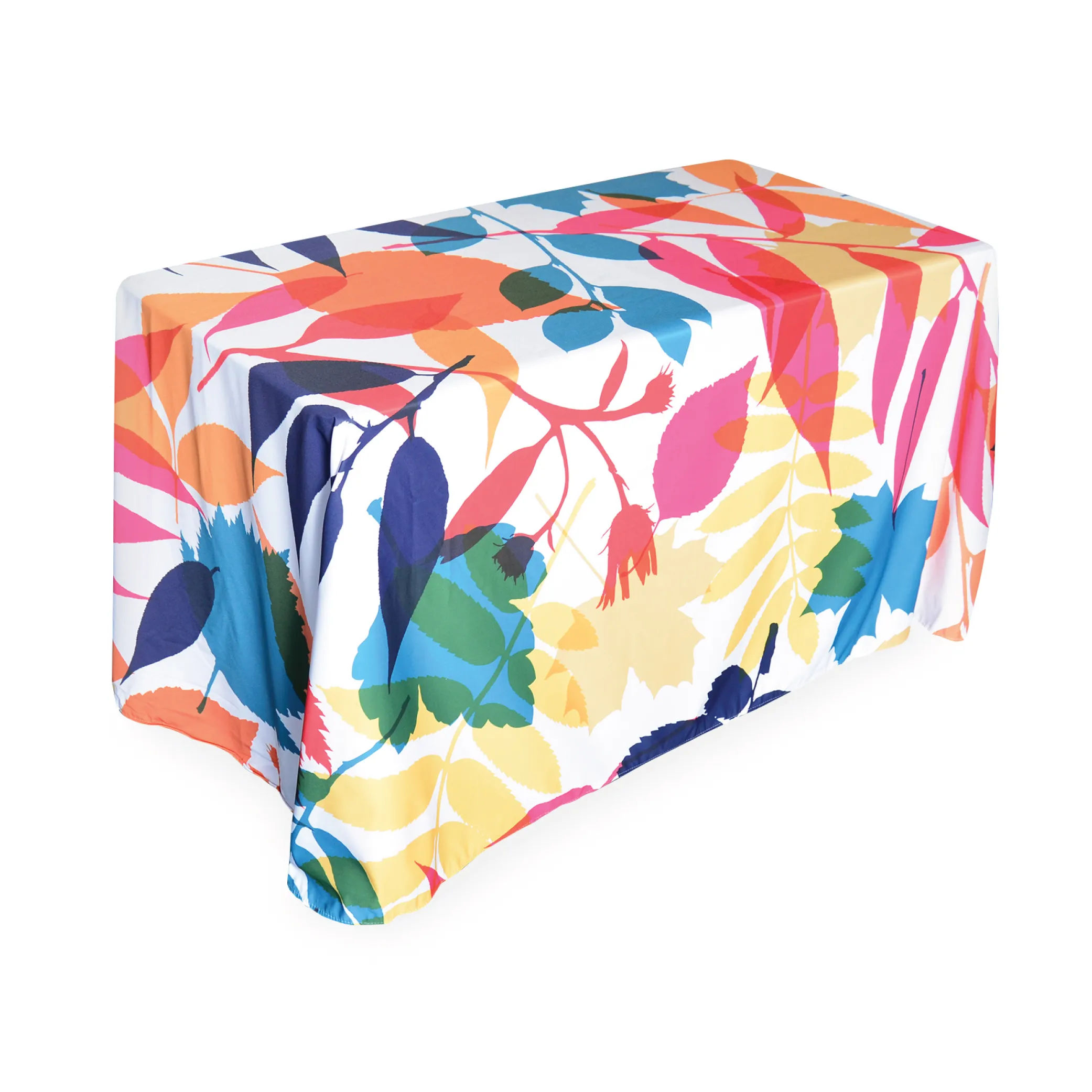
Simple, bold designs suit fabric better than fine detail. Large logos and strong colour blocks read cleanly even as the material moves and creases slightly. Intricate patterns and small text can distort where the fabric isn't perfectly taut.

Use Colour to Do the Work

As with most of the range, colour carries furthest. A strong brand colour across the whole cover makes your table identifiable across a hall even before anyone reads the logo, and it ties the table into the rest of your setup.

The dye-sublimation print goes into the fabric and survives washing, so the colour stays true over a long schedule of events. Supply your brand colour references so it matches your roller banners, gazebo or other kit, because the table cover is usually seen alongside them.

Match It to the Rest of the Stand

A table cover almost never works alone, it sits within a stand that has other branding. It should read as part of that setup rather than a separate item.

The usual arrangement is a roller banner or exhibition stand behind, the table cover in front, and perhaps a greeter stand alongside. Keep the colour, logo and tone consistent across all of them. Our guide to why printed table covers are worth it covers the cover's role in the wider setup.

Remember What the Drop Hides, Usefully

One quiet advantage worth designing for: the front drop hides everything stored under the table. That is part of the point, so you do not need to keep the lower area pristine for content, you can let it be colour, knowing boxes and bags sit behind it.

That reinforces the same layout: brand high on the drop where it shows, let the lower fabric be a clean colour that conceals the storage behind it.

Let the Design Team Help

Send your logo, brand colours and the table size you are covering, and the in-house team will position the branding on the front drop, keep it clear of the folds, and proof it before production. Tell them how your stand is arranged so they know which side is the front.

Frequently Asked Questions

Where should the logo go on a table cover?
High on the front drop, just below the table edge. That is the most visible part. The tabletop is covered by your display items, and the lower drop is often blocked by chairs and storage.
Can a table cover be printed on both sides?
No. The material has very low show-through, so it is printed on the front-facing side only. Design for one primary viewing direction and use a banner or backdrop to brand anything seen from behind.
What's different about designing a greeter stand?
A table cover is fabric and the corners fold and drape. A logo near a corner can bend around the fold or hide in the gather, so keep key elements in the flat central area of the front panel.
Will the print survive washing?
Yes. The design is dye-sublimated into the fabric, so it stays true through repeated washing across a schedule of events.
Expert advice from Gala Graphics


Need Help?

Request a call back