Branded motorsport marquee with printed canopy and walls

Designing an Inflatable Arch for Your Brand

Written by Jonathan Rodgers

An arch is branding people run through, drive under and photograph, which makes it the most seen structure at most events. Here is how to design one for your brand: what goes on the span, what belongs on the legs, and how to handle sponsors.

An inflatable arch is different from every other branded structure because people pass through it rather than past it. That changes what the design has to do. Someone approaching sees the whole shape from distance, then loses most of it as they get close and look up. Here is how to design an arch that works at both moments.

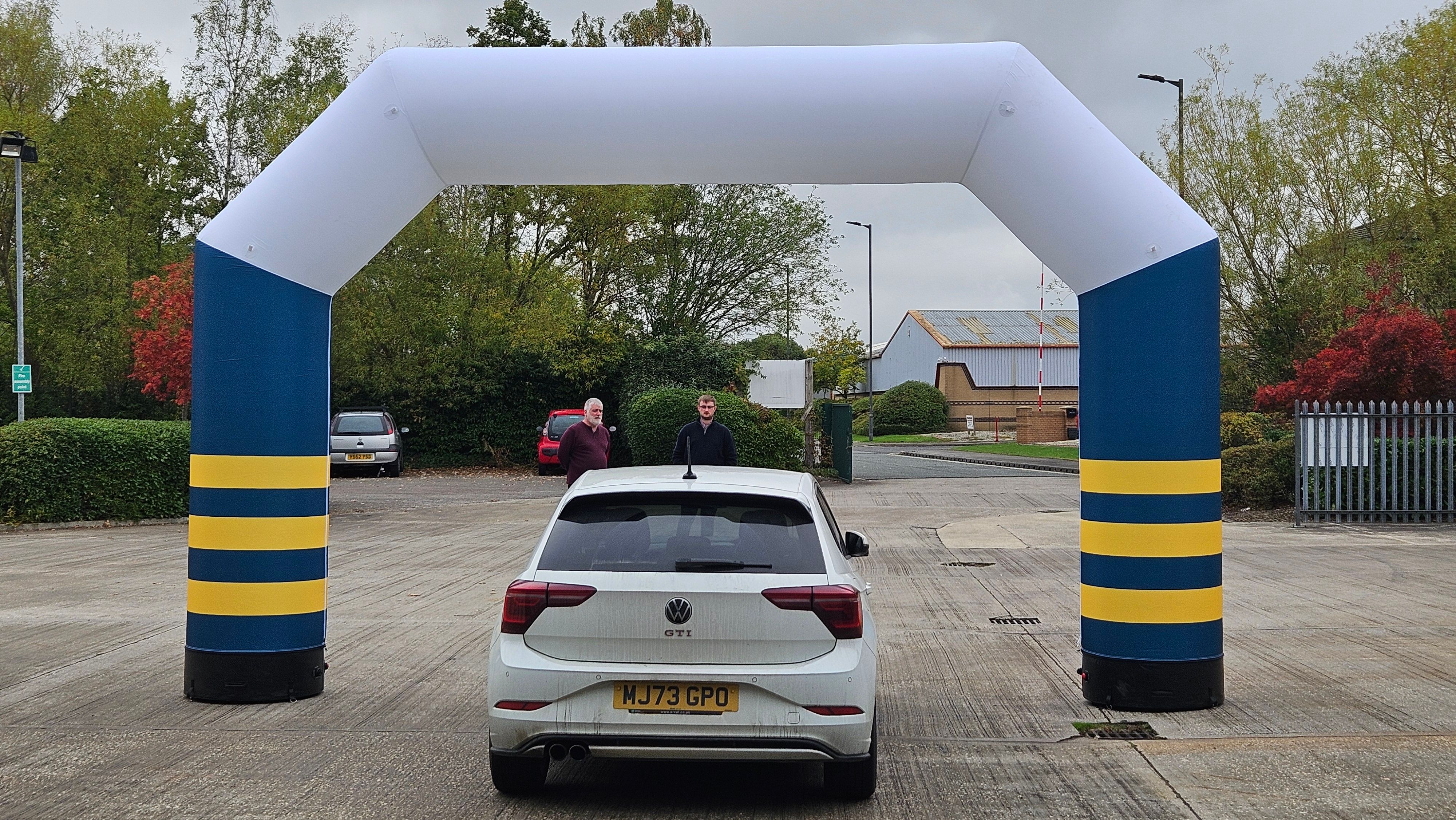
Most branded products are read from one position. An arch is read from three: from far away as a shape on the horizon, from a few metres as you approach it, and from directly underneath as you go through. A design that only works at one of those distances wastes the other two.

Start With Where the Arch Sits

The arch's position decides the design more than anything else. Work out which of these you are doing before you choose a layout.

A start or finish line is the classic use, and it is the one that gets photographed most. Every finisher photo has your arch in it, often with the timing clock and the runner underneath. That makes the top of the span the most valuable space you own.

An entrance arch marks a way in, so the priority is that people recognise it as the entrance from a distance and know whose event it is when they get there.

A sponsor arch exists to give a backer visibility in exchange for their money, which means the design brief is theirs as much as yours, and the space needs planning rather than improvising.
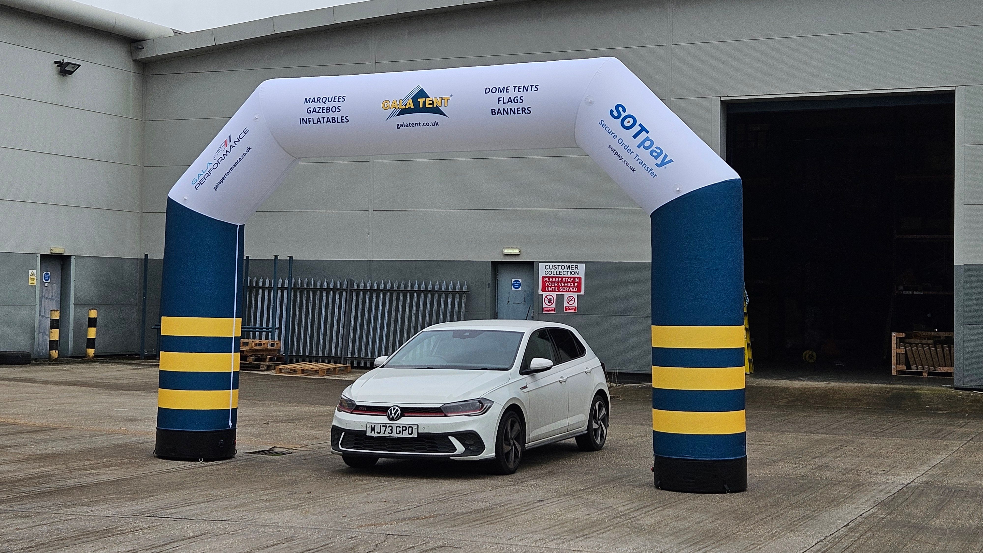
The Span Is Your Headline

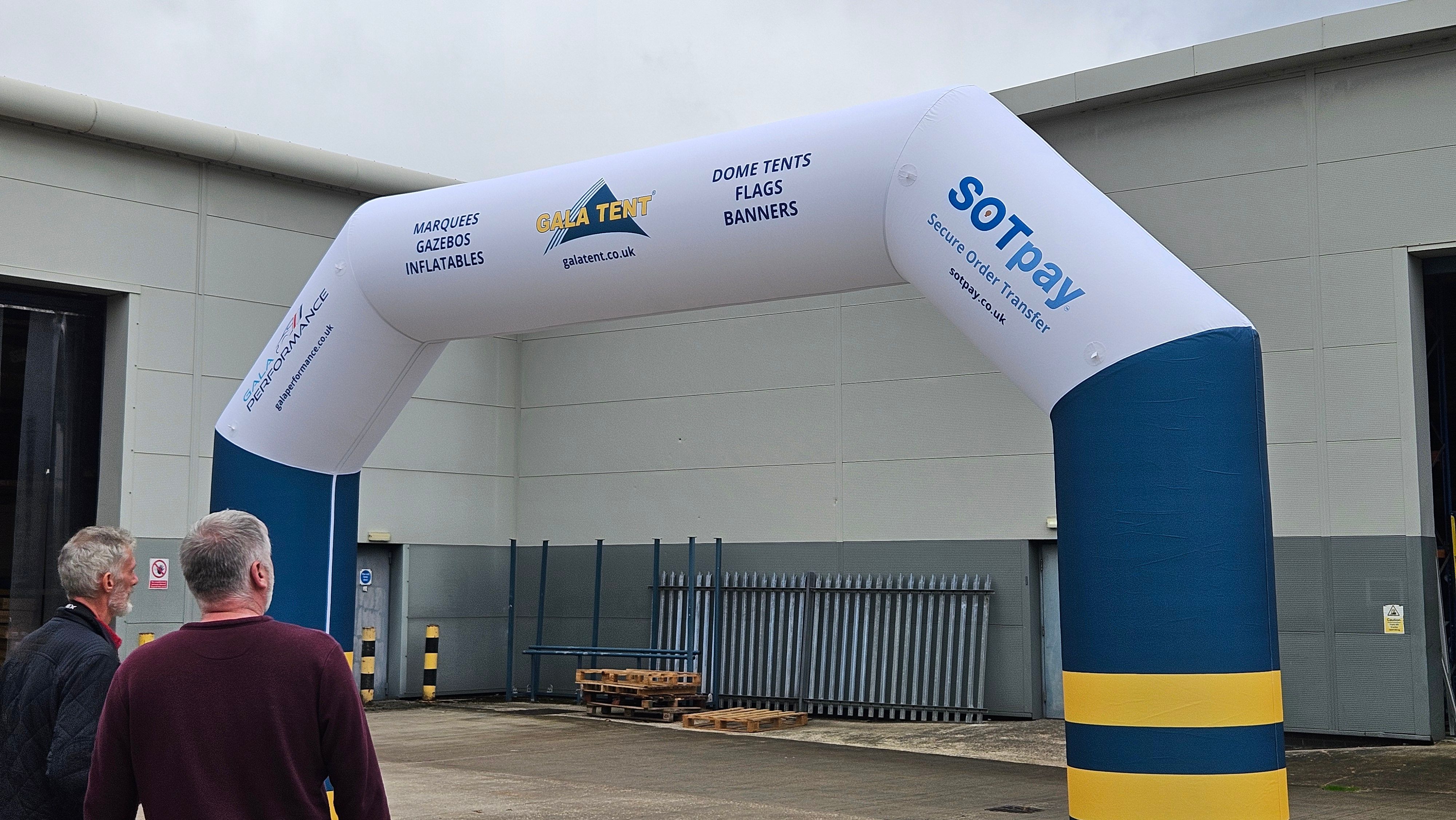
The horizontal top section is the part everyone sees from a distance and the part that appears in photographs. Treat it as the headline and give it one job.

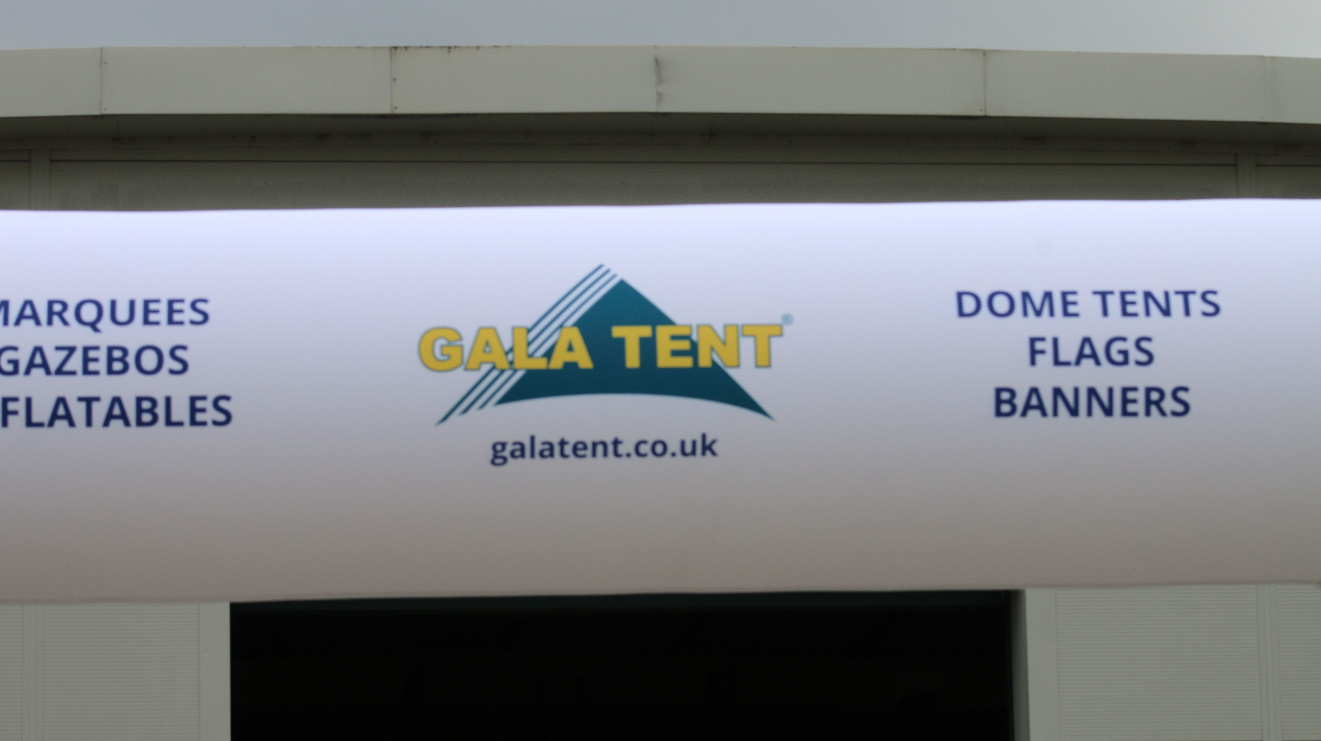
For most events, that job is your event name or your logo, large, centred, and readable from as far away as the sightline allows. Resist filling the span with several elements competing for the same space. If a runner approaching from two hundred metres cannot tell what the arch says, the span is doing nothing.

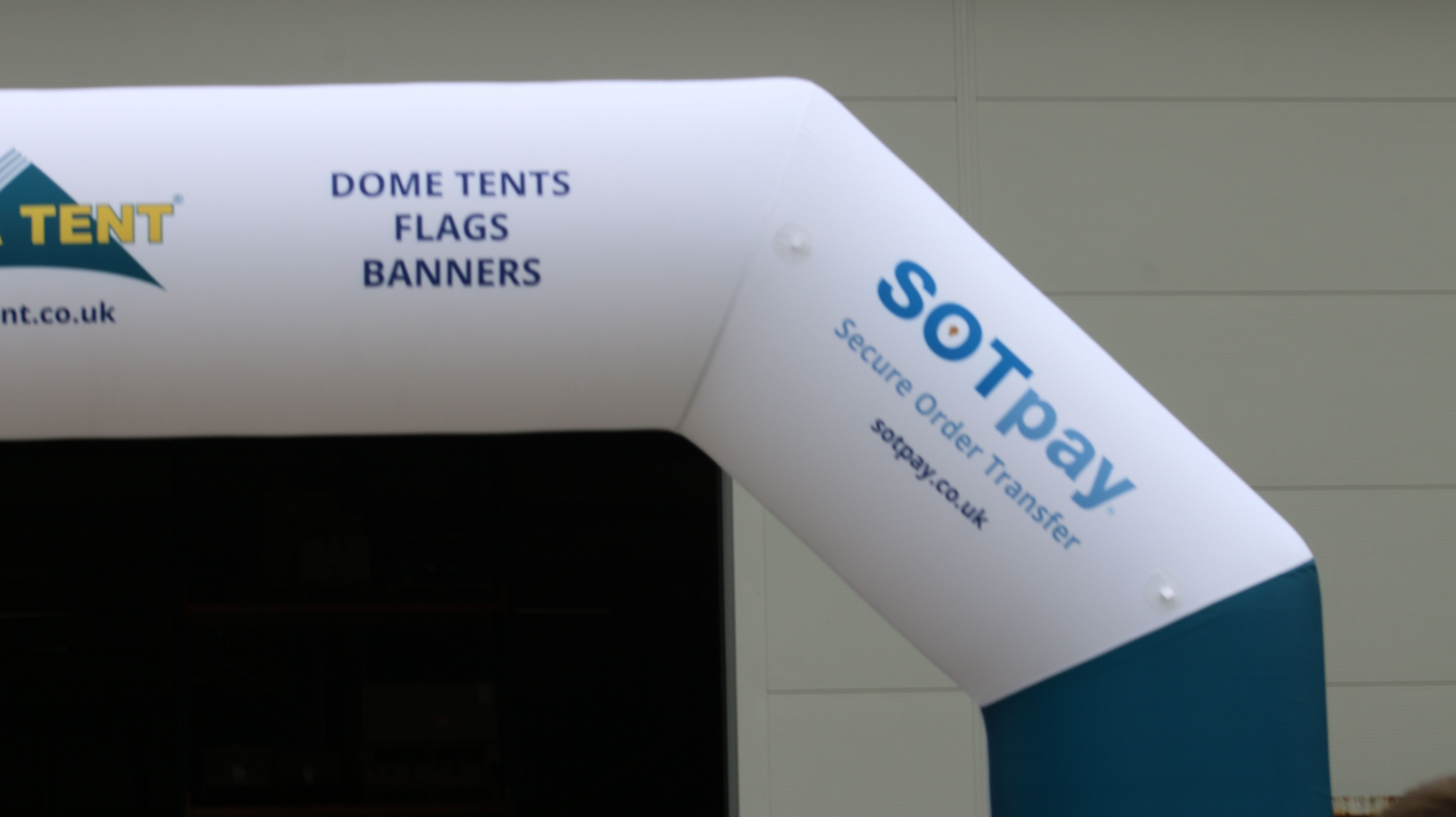
Bear in mind the span curves, so anything sitting at the far ends will foreshorten as it wraps away from the viewer. Keep the important content in the middle third where it stays face-on.

The Legs Are Your Second Space

The two vertical legs are read at close range, by people walking or running past them within a couple of metres. That makes them completely different real estate from the span.

Legs suit repeated logos, sponsor marks, a website address, or a simple graphic device in your brand colours. Because people pass them closely, slightly more detail works here than on the span. What does not work is treating the legs as an afterthought and leaving them blank while the span carries everything, because from many angles the legs are the most visible part of the structure.

Plan Sponsors Properly, Not Reactively

Sponsor logos are where most arch designs come unstuck. Committing sponsor space during the design stage is far easier than squeezing three extra logos onto a finished layout a week before the event.

A workable approach: your own identity owns the span, and sponsors get defined positions on the legs, sized by tier. If a title sponsor has been promised span presence, plan that from the outset and design your own branding around it rather than fighting for the same centre space.

If you know more sponsors may come on board later, remember that the graphics are printed to your artwork, so significant changes mean a reprint rather than an addition. Decide the hierarchy early.

Plan Around What Stands In Front Of It

Once you are trading, the lower part of the structure disappears behind staff, tables, stock, and visitors. Anything important placed low will be invisible for the entire event.

Keep the logo and any message above head height. Treat the lower area as colour and texture rather than information. It sounds obvious, and it is one of the most common things people only notice on the day.

Design for the Photograph

An arch is the backdrop for hundreds of photos, and in most of them only part of the arch is in frame. A finish-line photo usually captures the span and the tops of the legs, with the runner filling the middle.

That means anything positioned low on the legs will be cropped out of most pictures, and anything at the very ends of the span may be cut off too. If you want your branding in the photos rather than just at the event, concentrate it in the centre of the span and the upper section of the legs.

Keep It Bold and Keep It Simple

An arch is usually seen outdoors, at distance, often in motion, sometimes in poor light. Strong shapes and confident colour do the work. Thin outlines, small text, and detailed illustration disappear.

A useful test: reduce the design to a thumbnail. If you can still identify whose arch it is, the design is strong enough. If it becomes a coloured blur, it needs simplifying. The same principle underpins why some brands are remembered after events.

Match It to the Rest of Your Setup

An arch marks one point. The rest of your kit brands everything around it, so the two need to look related.

If you are running sail flags along the approach, PVC banners on the perimeter, or a printed gazebo for registration behind the line, use the same colours and the same logo treatment throughout. A matched set reads as a professionally run event, which matters at club and community events where credibility helps attract entries and sponsors. Our branding guide for sports clubs and teams covers the wider kit.

Let the Design Team Work It Up

You do not need a finished concept to start. Send your logo, your brand colours, any sponsor logos and a note on where the arch is going, and the in-house team will develop the layout and proof it before production. If your sponsor files are in poor shape, say so early, since those are usually the ones that cause problems.

For the product side rather than the design side, our guide to using an inflatable arch at your event covers the models, spans and how they work on the day.

Frequently Asked Questions

What should go on the span of an inflatable arch?
One clear headline: your event name or logo, large and centred. The span is read from a distance and appears in most photographs, so it should carry a single message rather than several competing ones.
Where do sponsor logos go on an arch?
Usually on the legs, positioned and sized by sponsorship tier, with your own identity owning the span. Plan sponsor space during the design stage rather than adding logos late.
Why does the middle of the arch matter most?
The span curves away at the ends, so content near the edges foreshortens. Keeping key elements in the middle third keeps them face-on and readable as people approach.
Can Gala Graphics design the arch for me?
Yes. Send your logo, brand colours, sponsor artwork and details of the event, and the in-house design team will develop the design and proof it with you before production.
Expert advice from Gala Graphics


Need Help?

Request a call back