Branded motorsport marquee with printed canopy and walls

Designing an Inflatable Shelter for Your Brand

Written by Jonathan Rodgers

An inflatable shelter is one large uninterrupted branded surface, which gives you more freedom than any framed structure and more decisions to make. Here is how to design one for your brand: what goes on it, where it belongs, and how bold to go.

An INFL8 inflatable shelter prints edge to edge with no frame breaking up the surface, so you are not fitting your branding into panels. You are deciding what an entire structure should look like in your brand. That is a bigger creative decision than most people expect, so here is how to approach it.

With a framed structure, the frame makes a lot of decisions for you. Roof panels, valance, walls: each is a defined space, and you place something in each one. An inflatable has no such divisions. The whole shape is yours, which is liberating and slightly daunting, because a blank curved structure gives no clues about where to start.

Inflatable structure

Decide What the Structure Is For

Before choosing anything visual, decide what job the inflatable is doing. That answer shapes every design decision after it.

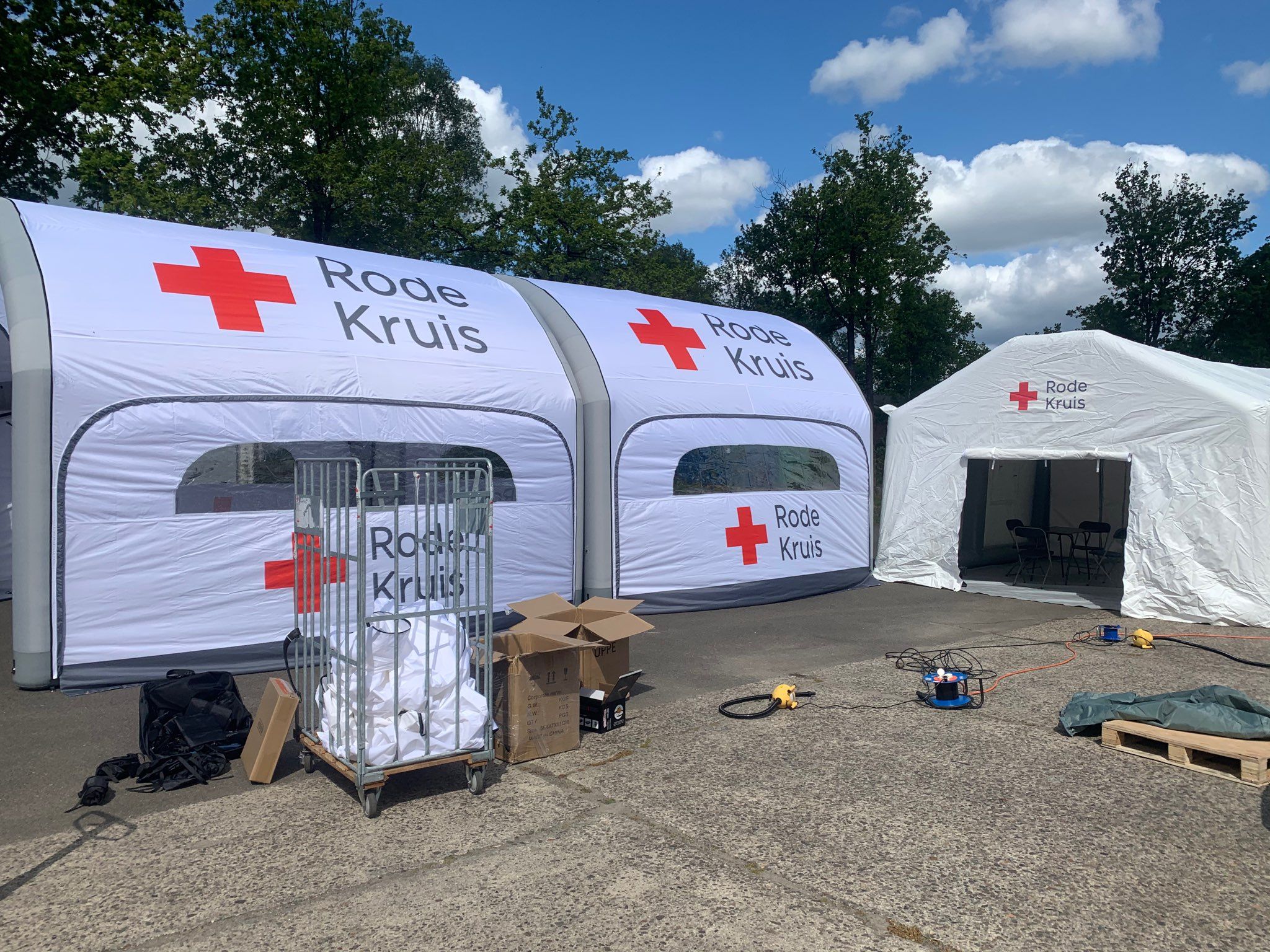
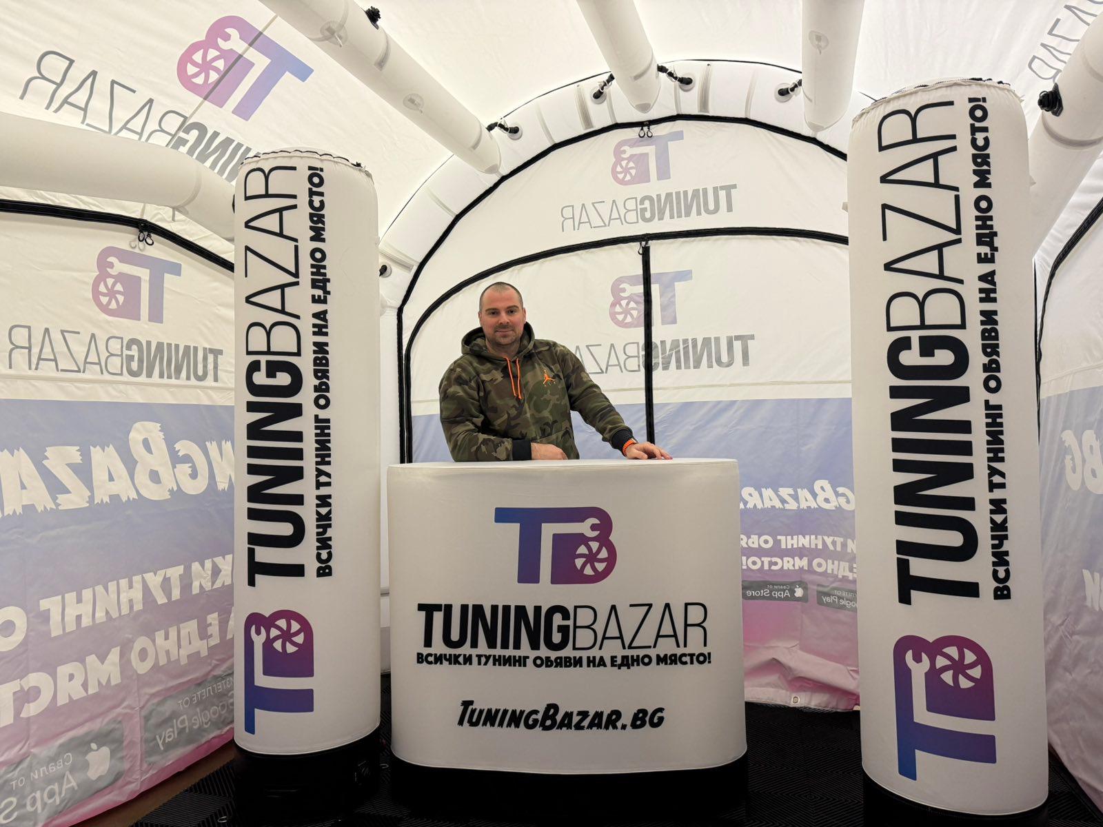
If it is a brand presence, an activation, or a photo point, the structure itself is the message. Go bold, commit to your brand colours across the whole shape, and let the logo be the only text. Nobody reads an activation, they recognise it.

If it is a working stand where you talk to people and sell, the structure needs to identify you from distance and then support a conversation up close. That justifies a little more information: what you do alongside who you are.

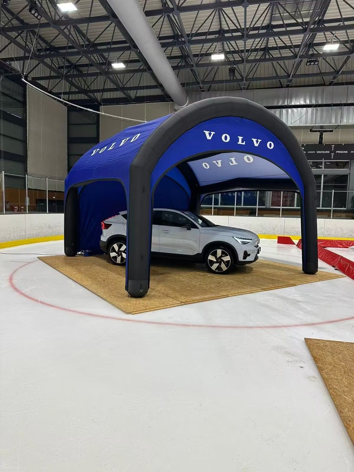
If it is a hospitality or VIP space, the design usually wants restraint. A confident single colour with a clean logo reads as considered, where a busy design reads as a trade stand.
Choose Between a Brand Colour and a Full Design

This is the biggest fork in the road, and both routes work.

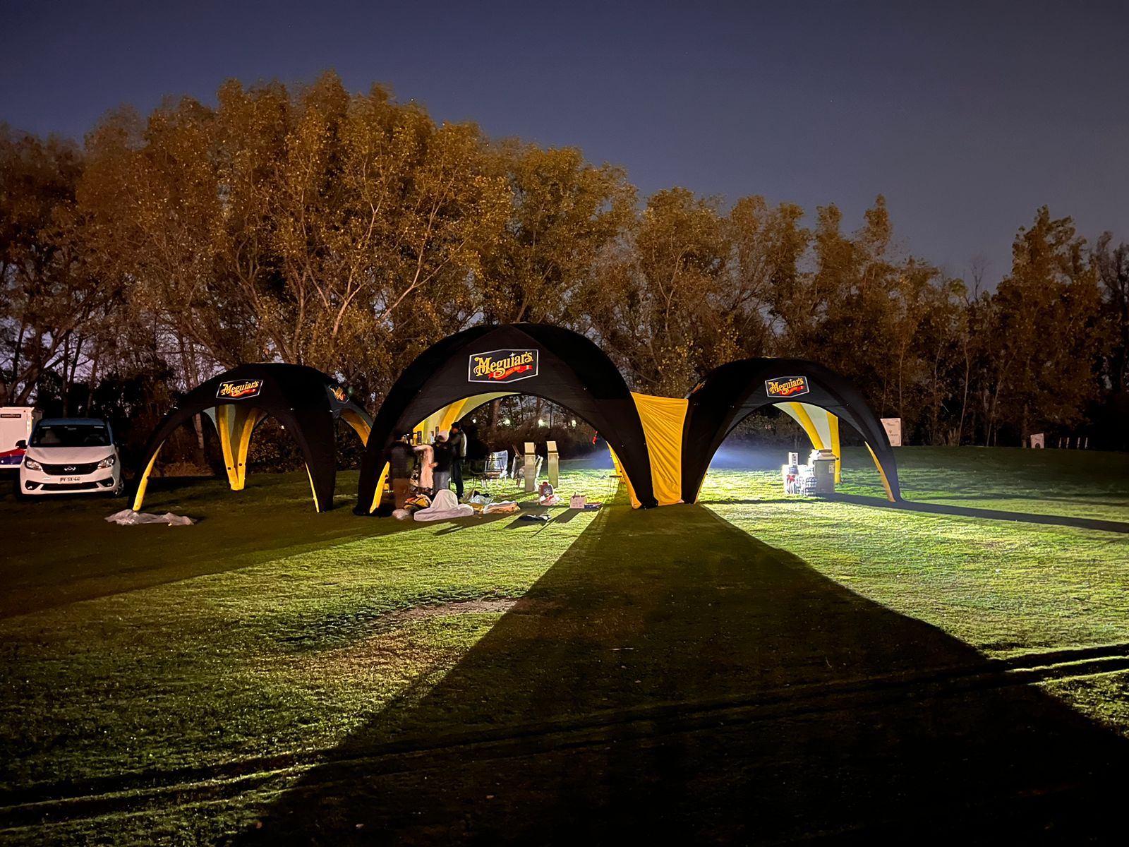
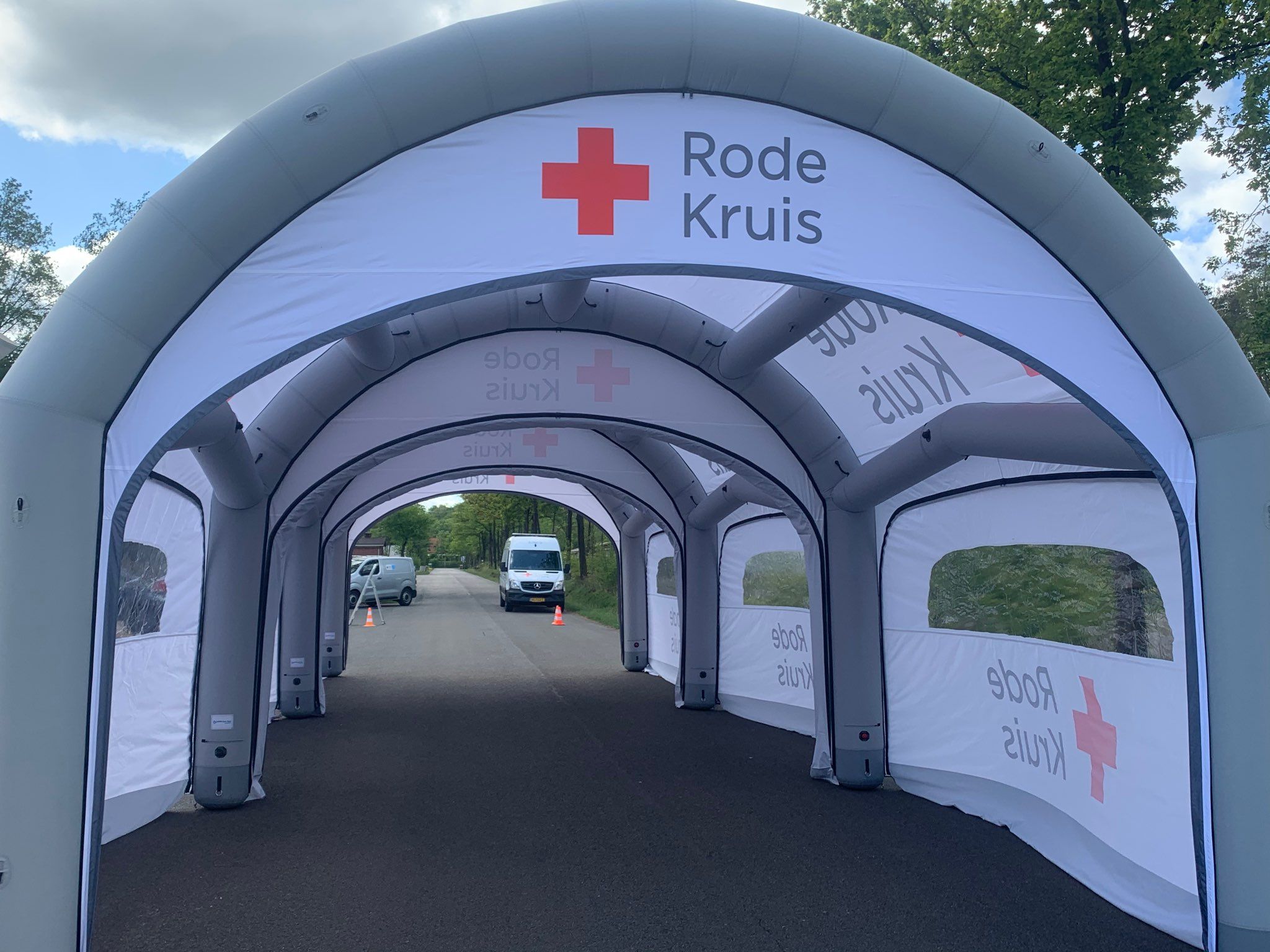
A single dominant brand colour with your logo placed on it is the most reliable option. It reads instantly, it is unmistakably yours if your colour is distinctive, and it never looks cluttered. Most of the strongest inflatables we produce take this route.

A full-surface design using imagery, pattern, or a themed concept turns the structure into a talking point. It suits consumer brands, festivals, launches, and anyone whose product is visual. It asks more of you creatively, and it is worth committing to properly rather than doing half-heartedly, since a tentative full design tends to look like an accident.

What rarely works is the middle ground: a plain structure with a small logo on one side. It uses none of the impact you are paying for.

Work Out What Actually Needs to Be On It

The temptation with a large surface is to fill it. Resist that. Decide what genuinely earns its place:

  • Your logo. Always. Usually more than once, so it reads from more than one direction.
  • Your brand colour. Doing more work than anything else at distance.
  • What you do, if it is not obvious from the logo alone. A short phrase, not a sentence.
  • A website or handle, if you want people to look you up afterwards.

Everything beyond that is usually better on a banner, a roller banner or a leaflet, where people read at close range. The structure is for recognition. The detail belongs on the things around it.

Inflatable structure

Remember It Is Seen From Every Side

An inflatable is freestanding and open, so people approach from any direction. There is no reliable front the way there is with a stand against a wall.

That changes how you distribute branding. Rather than designing one face and leaving the rest plain, spread the identity around the structure so every approach delivers something recognisable. Think about where the entrance faces, which side gets the footfall, and what someone sees walking towards you from the car park versus from the main thoroughfare.

Plan Around What Stands In Front Of It

Once you are trading, the lower part of the structure disappears behind staff, tables, stock, and visitors. Anything important placed low will be invisible for the entire event.

Keep the logo and any message above head height. Treat the lower area as colour and texture rather than information. It sounds obvious, and it is one of the most common things people only notice on the day.

Make It Match the Rest of Your Kit

An inflatable rarely stands alone. If you also run a printed gazebo, sail flags, banners or café barriers, the whole setup should read as one identity rather than several.

Use the same colour, the same logo treatment, and the same tone across every piece. That consistency is what makes a business look established, and it is the point behind why customers remember some brands after an event. If you are building a setup in stages, our guide to what to buy first on any branding budget covers the order to build in.

Think About How It Photographs

Inflatables get photographed more than most branded structures, because the shape draws people in. Those photos become free reach on social media, but only if your branding survives the crop.

In a typical phone photo taken a few metres away, the viewer sees part of the structure, not all of it. A design that only makes sense as a complete composition loses its identity in every picture. A logo that reads in a partial view is worth more than a clever layout that only works head-on.

Let the Design Team Help

You do not need to arrive with a finished concept. Send your logo, your brand colours, and a sense of what the structure is for, and our in-house team will work it up and proof it before anything is produced. If your files need preparing, our guide to supplying print-ready artwork explains what helps, and the team can take a logo to print-ready for you.

For the product detail rather than the design thinking, our guide to INFL8 inflatable event structures covers sizes and how they work.

Frequently Asked Questions

What should I put on an inflatable shelter?
Your logo, your brand colour, and at most a short phrase saying what you do. Detail belongs on banners and printed material nearby, because the structure's job is recognition from a distance.
Should I use one brand colour or a full design?
Both work. A single dominant colour with a clean logo is the most reliable and reads instantly. A full-surface design suits consumer brands and activations, but commit to it properly rather than half-way.
Where should the logo go?
High enough to clear the people and tables standing in front of it, and repeated so it reads from more than one direction, since an inflatable is approached from all sides.
Can Gala Graphics design it for me?
Yes. Send your logo, brand colours and a brief, and the in-house design team will develop the design and proof it with you before production.
Expert advice from Gala Graphics


Need Help?

Request a call back