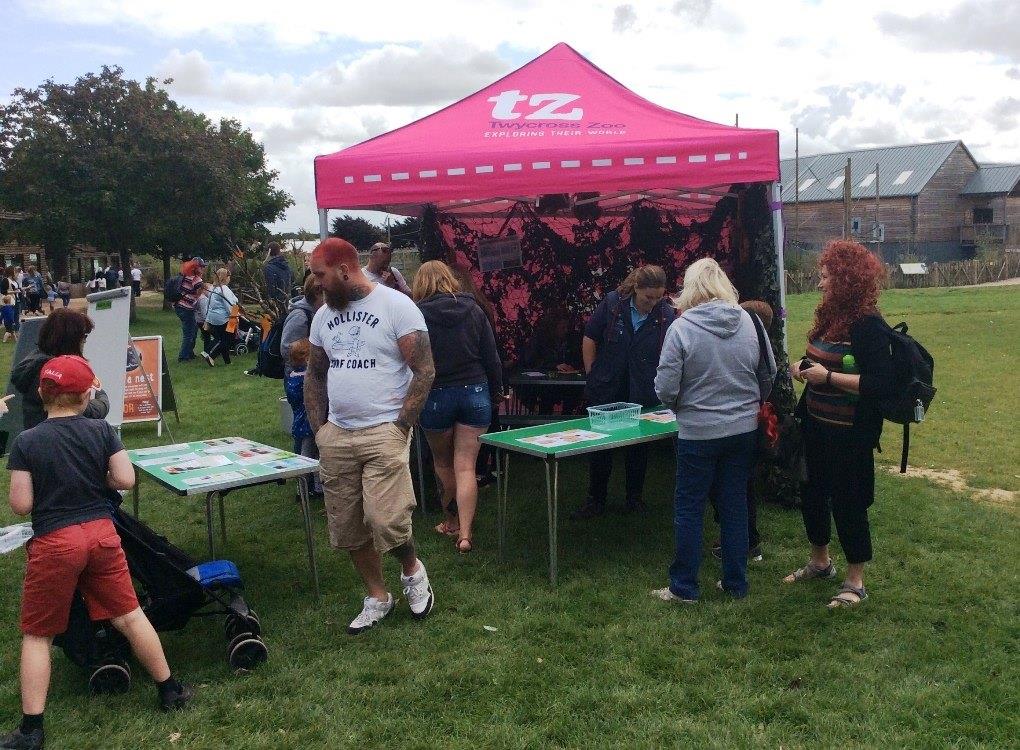
Printed promotional gazebo branded for a zoo

The Science Behind Visual Communication

Written by Jonathan Rodgers

Your brain reads an image in 13 milliseconds and remembers it longer than any slogan. Here is the real science behind visual communication, from pre-attentive processing to the way the eye travels a layout, and how to design branding that works with it.

Visual communication works because the brain processes images faster than it processes words, forms judgements before conscious thought, and remembers what it sees for longer than what it reads. Understanding the science behind that gives businesses a real advantage in how they design signage, displays, and branding. Here is what the research actually shows, and how to use it.

Most branding advice tells you that visuals matter. Far less of it explains why. The answer sits in how the human brain takes in and stores visual information, and once you understand the mechanisms, design decisions stop being guesswork. Every principle below is something you can apply to a gazebo canopy, an exhibition stand, or a shopfront.

The Brain Reads an Image in Milliseconds

The eye and brain process visual scenes extraordinarily fast. MIT neuroscientists found the brain can identify an image seen for as little as 13 milliseconds, far faster than the 100 milliseconds earlier studies had assumed. That is quicker than a single blink. For a business, it means a customer has already registered your stand, colours, and general impression before they have consciously decided to look at you. First impressions are not formed during a conversation. They are formed before one is possible.

Pre-Attentive Processing Decides What Gets Noticed

Before conscious attention engages, the brain automatically detects a small set of visual features across an entire scene at once: colour, contrast, size, orientation, and movement. This is called pre-attentive processing, and it is why a single bold element in a busy environment pulls the eye without the viewer choosing to look. A feather flag works on exactly this principle. Its height and movement are detected before anything is read. Designing with pre-attentive features in mind is how you get noticed in a crowded hall or high street.

Images Are Remembered Better Than Words

The picture superiority effect describes a well-documented finding: people remember images far more reliably than text, and the gap widens over time. Shown a word and a picture, most people recall the picture days later while the word fades. For branding, this is why a strong visual identity outlasts a clever slogan in a customer's memory, and it feeds directly into why some brands stay memorable after an event. Invest in a distinctive visual, not just a well-written line.

Easy to Read Feels More Trustworthy

Processing fluency is one of the more surprising findings in the field. When information is easy for the brain to process, through clear type, strong contrast, and clean layout, people judge it as more trustworthy and more likely to be true. The reverse also holds: cluttered, low-contrast, hard-to-read design creates a subtle sense of doubt, even when the message is sound. Legibility is a credibility decision, not only an aesthetic one.

Branded event stand with clear high-contrast graphics

The Brain Groups What It Sees

The Gestalt principles explain how the brain organises visual information automatically. A few are worth designing around:

  • Proximity: elements placed close together are read as related, so grouping your logo, message, and product visual keeps them connected in the viewer's mind.
  • Similarity: shared colour or shape signals that items belong together, which is how consistent branding across products reads as one identity.
  • Figure and ground: the brain separates a subject from its background, so strong contrast between your message and its backdrop makes it readable at a glance.
  • Closure: the mind completes simple shapes, which is why clean, uncomplicated logos are easier to recognise and recall.

These are the mechanics behind the advice in our gazebo design guide and exhibition stand guide.

Distinctive Things Get Remembered

The isolation effect, sometimes called the Von Restorff effect, describes how an item that stands out from those around it is far more likely to be remembered. At an event where most stands look alike, the one that breaks the pattern earns the memory. This is the science behind standing out at a busy show, covered in practical terms in our guide to the best branding products for outdoor events. A printed star shade tent among rows of square gazebos is the isolation effect working in your favour.

The Eye Travels a Layout in a Predictable Path

People do not read a display evenly. On text-heavy layouts the eye tends to follow an F-shaped path, scanning the top and left before dropping down. On sparse, image-led layouts such as posters and banners, it more often follows a Z-shaped path from top-left to bottom-right. Placing your logo, key message, and call to action along that natural path means customers absorb them in the right order. Fight the path and your most important information gets missed.

Turning the Science Into Design Decisions

Every principle above points to the same practical conclusions: keep messaging simple so it processes fast, use contrast and colour deliberately so the right things get noticed first, stay consistent so the brain groups your branding as one identity, and give the eye a clear path through the information. Colour carries a large share of this work, which is why we cover it in depth in the psychology behind colour in branding. The same thinking applies indoors, explored in why indoor branding matters as much as outdoor. If you would like help applying it to your own branding, the team can advise.

Frequently Asked Questions

How fast does the brain process visual information?
Research from MIT found the brain can identify an image seen for as little as 13 milliseconds, faster than a blink, which is why first impressions form before any conscious decision.
Why are images remembered better than words?
The picture superiority effect shows people recall visual information more reliably than text, and the advantage grows over time, making a strong visual identity more memorable than a slogan.
What is pre-attentive processing?
It is the brain's automatic detection of features such as colour, contrast, size, and movement across a scene before conscious attention, which determines what gets noticed first.
Does clear design really affect trust?
Yes. Processing fluency research shows that information which is easy to read and process is judged as more trustworthy, so legibility and clean layout support credibility.
How do I apply visual science to my branding?
Keep messaging simple, use contrast and colour deliberately, stay consistent across every product, and design around the natural path the eye follows. Our gazebo and exhibition stand guides show it in practice.
Expert advice from Gala Graphics


Good Afternoon, how can I assist you today?

Assistance
ExpandAssistance   Alexandria