Branded motorsport marquee with printed canopy and walls

Designing a Floor Sticker for Your Brand

Written by Jonathan Rodgers

A floor sticker can be any shape up to a metre, is walked over from every direction, and costs the same whatever its shape. Here is how to design one for your brand, and why the outline is as much a design decision as the artwork on it.

A floor sticker gives you a design freedom nothing else in the range does: it can be cut to any shape you like, and the shape costs the same whether it is a plain square or your logo's exact outline. That, plus the fact it is walked over from every direction, is what makes designing one different. Here is how to approach it.

Explore Floor Stickers Get Design Advice Download a Brochure

A floor sticker is read from above, at a glance, by someone walking. It has no fixed viewing direction, it can be any shape within a metre square, and it is usually there to do one specific job: point, promote, or brand a spot. The design follows from those things.

Floor Sticker
Floor Sticker

Decide the Job First

Floor stickers do a few distinct jobs, and the design depends entirely on which one yours is doing.

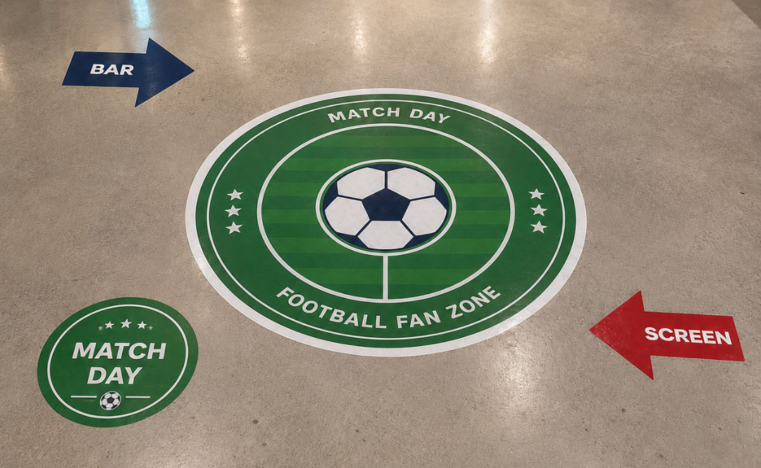
A wayfinding graphic, an arrow or a directional marker, needs to be understood instantly and from the direction people are travelling. Clarity beats everything.

A promotional graphic, drawing attention to an offer or a product at the point of decision, needs to stop someone mid-step, so it wants boldness and a very short message.

A branding graphic, your logo on the floor of an entrance or an exhibition stand, is pure recognition and works best as a clean logo with space around it.

Establish which of these you are making before you design, because an arrow and a logo are designed very differently.
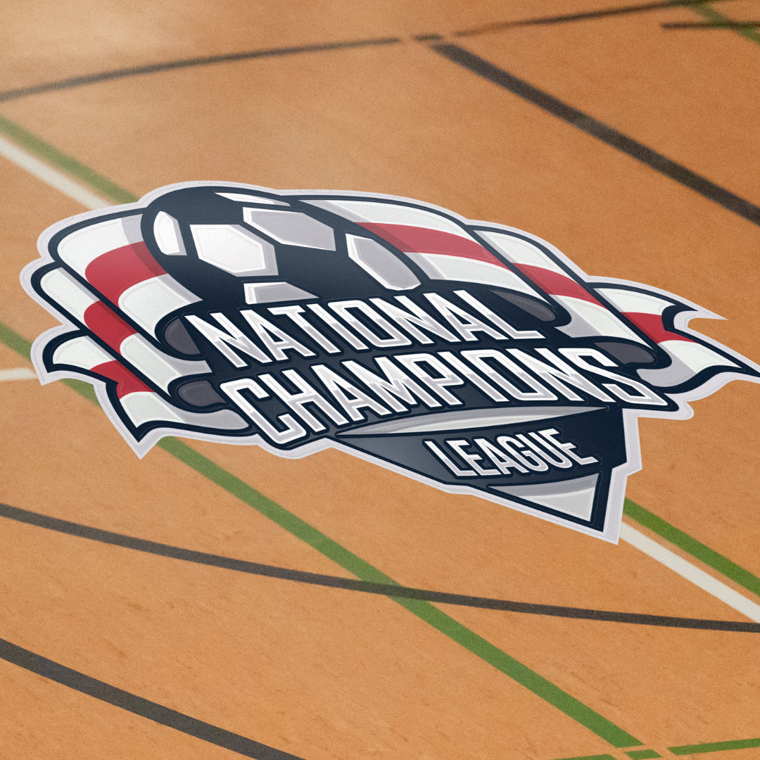
The Shape Is Part of the Design

This is the floor sticker's unique advantage. Because it is cut to any shape up to one square metre for a single fixed price, the outline is a free design choice, not a cost decision.

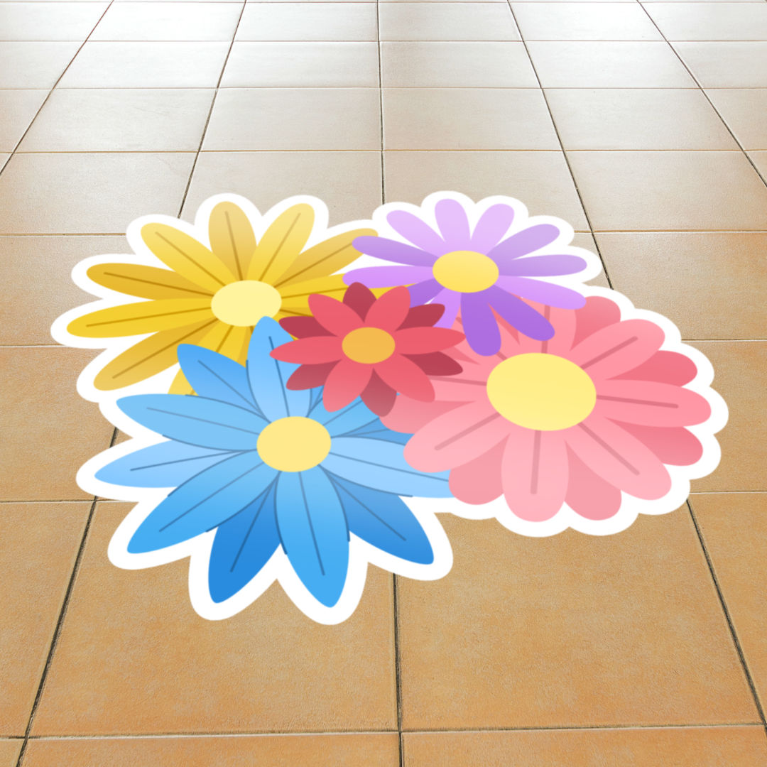
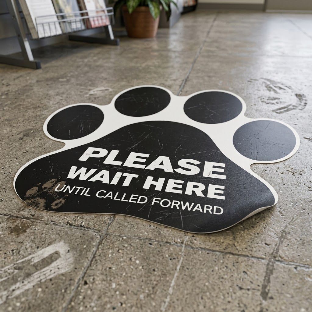
Use it. A directional graphic can be cut as an actual arrow rather than an arrow printed inside a square. A logo can be cut to its own outline so it sits on the floor as a shape rather than a tile. Footprints, circles, a product silhouette, all cost the same as a plain rectangle. A shaped sticker reads as deliberate and designed, where a square with a graphic floating in it reads as generic.

There is one practical point that follows: for a clean cut, the artwork needs a clear outline for the cut path to follow, which is why vector artwork matters more here than on almost any other product. A crisp shape cuts crisply.

Design to Be Read From Above and From Any Angle

A floor sticker is seen from a standing person looking down, in motion, and there is often no single direction they approach from. That shapes the layout.

For branding and promotional stickers, a centred, roughly symmetrical design avoids the problem of being upside down to people coming from the other side. For wayfinding, the opposite applies: an arrow only makes sense one way round, so it must be oriented to the direction of travel, and if people move both ways you may need one facing each way.

Either way, keep it bold. A sticker is read in the second it takes to walk over it. Large shapes, short words and strong colour work. Fine detail and small text are lost underfoot.

Keep the Message to Almost Nothing

There is very little room for words on something people walk across without stopping. One instruction, "This way", "Queue here", "50% off", or no words at all beyond a logo, is the right amount.

If there is more to say, the floor sticker is the wrong place to say it. Its job is to catch the eye and point or prompt, and something at eye level carries the detail.

Floor Sticker
Floor Sticker

Use Strong Colour and Contrast

Floors are busy, often patterned, and seen at an angle under variable lighting. Your sticker has to lift off that background, so strong contrast between the design and both the sticker background and the floor around it is essential. A pale design on a light floor disappears; a bold colour block stops the eye.

Because these are usually short-term and promotional, this is a product where you can be louder than your usual brand palette allows, and it often pays to be.

Think About Its Short Life

Floor stickers use a removable adhesive and are made for short to medium-term use, which frees up the design. You can be seasonal, campaign-specific and dated in a way you would avoid on a permanent product, because the sticker comes up cleanly when the promotion ends.

That means a floor sticker is the right place for the time-limited message, the launch, the sale, the event wayfinding, that you would keep off a logo mat or a gazebo precisely because those need to last.

Match It to the Space

If the sticker sits within a branded environment, an exhibition stand, a shop, a reception, it should share the colour and logo treatment of everything around it, so the floor reads as part of the same identity as the walls and displays. A floor sticker that leads toward a stand or an entrance works best when it visibly belongs to it. Our guide to creative ways to use floor stickers covers the wider uses.

Let the Design Team Help

Send your logo or artwork, your colours, and a note on what the sticker is for and where it is going. The in-house team will help you make the most of the shape, set the cut path from clean artwork, get the orientation right for the job, and proof it before production.

Frequently Asked Questions

What should I put on a floor sticker?
As little as possible: a bold graphic and at most one short instruction, or just a logo. It is read in a moment by someone walking over it, so clarity and boldness matter far more than detail.
Can a floor sticker be any shape?
Yes, any shape up to one square metre, for a single fixed price. The outline is a free design choice, so cutting a sticker to an arrow or to your logo's shape reads as far more deliberate than a graphic inside a square.
Which way up should the design go?
For branding, a centred symmetrical design avoids being upside down to people approaching from different directions. For arrows and wayfinding, orient to the direction of travel, and use one each way if people move both ways.
Why does vector artwork matter for floor stickers?
The sticker is cut to shape, and the cut path follows the outline of the artwork. A clean vector outline cuts crisply, which is why it matters more here than on most products.
Expert advice from Gala Graphics


Good Morning, how can I assist you today?

Assistance
ExpandAssistance   Alexandria