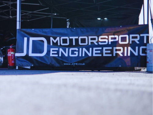
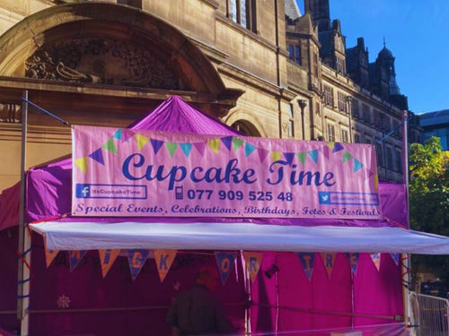
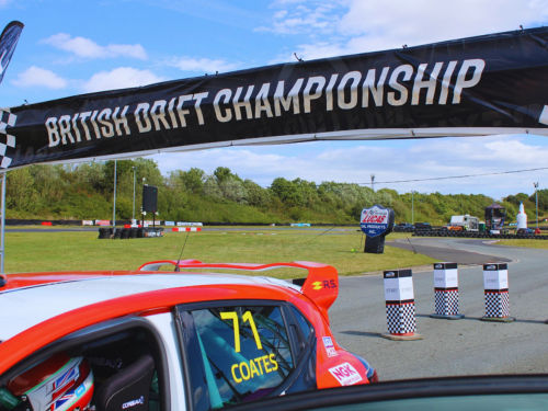
Branded motorsport marquee with printed canopy and walls

Designing a Printed Banner for Your Brand

Written by Jonathan Rodgers

A banner is read in a few seconds, often from a moving car or across a field. Here is how to design one for your brand: how much you can realistically say, where it belongs on the banner, and what changes when you print on mesh.

A printed banner is the most flexible branded surface you can buy, and the easiest to get wrong. Because it is a big rectangle and it is cheap, the temptation is to fill it. The banners that actually work do the opposite. Here is how to design one for your brand.

Explore Printed Banners Get Design Advice Download a Brochure

The first thing to establish is how your banner will be read. A banner on a fence beside a main road is seen for two or three seconds by someone doing forty miles an hour. A banner behind a market stall is read at four metres by someone already standing there. Those are completely different design briefs, and the most common mistake is designing the second and hanging it where the first is needed.

Decide the Reading Distance First

Before anything else, work out how far away people will be and how fast they are moving. Everything follows from that.

For roadside and long-distance viewing, you get one message. Realistically that is a name and one word or number: what you are, and how to act on it. Anything more will not be read.

For close-range viewing behind a stand or at an entrance, people are stationary and can take in more, so a logo, a short line about what you do, and a website or phone number is reasonable.

If the banner has to serve both, design for the longer distance. A banner that works at fifty metres still works at four. The reverse is never true.
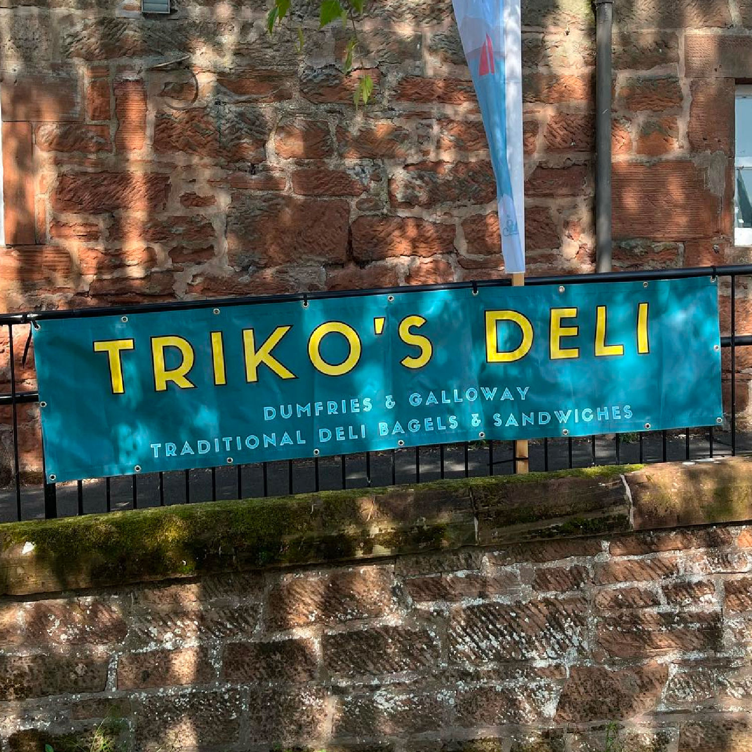
Size the Type Properly

Text size is where banners fail most often. Artwork looks perfectly readable at a hundred percent on a screen, then becomes illegible on a fence.

A useful working method: reduce your design on screen until it is roughly the size of a playing card, then look at it from arm's length. That approximates a large banner seen at distance. If the main message has disappeared, the type is too small, and shrinking the logo to make room for more words is the wrong fix.

As a rule, your headline should occupy a substantial proportion of the banner height. On a typical roadside banner, one bold line filling a third of the height beats four tidy lines filling the same space.

Give the Design Room to Breathe

Empty space on a banner feels like waste, which is why people fill it. In practice, generous space around your message is what makes it readable from a distance. A crowded banner reads as noise before anyone works out what it says.

Keep clear margins around the edges too. Banners are fixed with eyelets and are often tied to railings, scaffolding or fence posts, and the outer few centimetres can end up wrapped, folded round a post, or obscured by a cable tie. Anything important sitting right at the edge is at risk, so bring key content inwards.

Choose Contrast Over Subtlety

Outdoors, in changing light and often in rain, contrast is what keeps a banner legible. Dark type on a light background or light type on a strong solid colour both work. Mid-tone on mid-tone, pale colours on white, or text laid over a busy photograph are the combinations that fail.

If you want to use a photograph, keep it to one side or use it as a background with a solid colour panel behind the text, rather than laying words directly over detailed imagery.

What Changes When You Print on Mesh

Mesh is perforated so wind passes through it, which makes it the right material for fence lines, scaffolding and exposed sites. That perforation slightly softens fine detail compared with solid PVC.

It does not change the way you design, it just reinforces the same advice: go bolder. Large type, strong shapes and solid colour all reproduce well on mesh. Small text and delicate line work are where the difference shows. Since mesh tends to be used for long runs on perimeters, viewed from a distance, the design instincts pull the same way anyway.

Design for Where It Will Hang

A banner is shaped by its site more than most products. Think about the actual position before you finalise a layout.

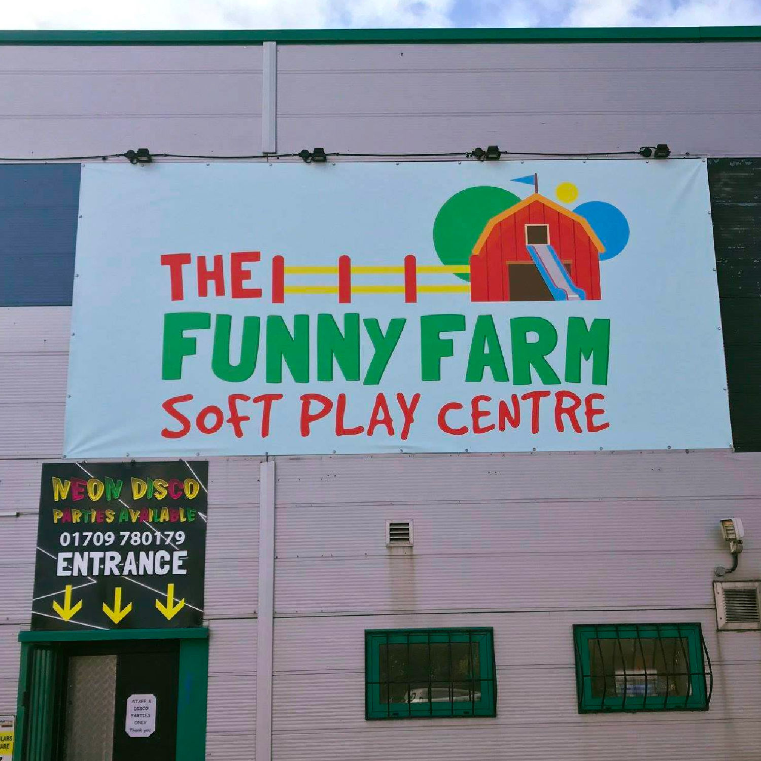
A long, low banner on a perimeter fence suits a single horizontal line of large type. A near-square banner on a wall suits a stacked layout with the logo above the message. A banner hung high above head height should have its content in the lower portion, since the top edge is often the first thing lost to a sightline. A banner behind a stand needs its key content above the heads of the people standing in front of it.

If you are ordering several banners for the same site, deciding which one carries which message is part of the design job. Repeating the same banner three times along a fence is usually more effective than three different messages, because repetition builds recognition.

Match It to the Rest of Your Setup

Banners rarely work alone. If you are also running sail flags, café barriers or a printed gazebo, the banner should look like part of the same family: same colour, same logo treatment, same tone.

The usual division of labour is that flags pull attention from a distance, banners carry the message, and barriers and shelters hold the space. Design them as a set rather than individually, which is the approach in our guide to the best branding products for outdoor events.

Consider How Long It Needs to Last

If a banner carries a date, a price or an event year, it is disposable by design. That may be exactly right for a one-off, but if you attend the same events annually it is worth leaving dates off so the same banner works next season.

Many organisations run a permanent banner carrying just the name and identity, plus a smaller dated one alongside it that gets replaced each year. That way the expensive large banner keeps working and only the cheap element changes.

Let the Design Team Help

Send your logo, your brand colours, the banner size and a note on where it is going and how far away people will be. The in-house team will work the layout up and proof it before production, and will tell you if your message is too long for the distance rather than printing it and letting you find out on site.

For the product side, our comparison of PVC banners versus outdoor frame banners covers which type suits which job.

Frequently Asked Questions

How much text should go on a banner?
It depends entirely on reading distance. For roadside or long-distance viewing, one short message. For close range behind a stand, a logo, a short line and contact details is reasonable. When in doubt, design for the longer distance.
How big should the text be on a banner?
Big enough that the message survives being shrunk to playing-card size on screen and viewed at arm's length. If the headline disappears at that scale, it is too small for a large banner at distance.
Should I choose PVC or mesh?
Mesh lets wind through, which suits fence lines, scaffolding and exposed sites. Solid PVC gives the boldest print for sheltered positions. Both take the same artwork, so a mixed setup still matches.
Why should I keep content away from the edges?
Banners are tied through eyelets to railings, posts and scaffolding, so the outer edges can be wrapped, folded or obscured. Bringing key content inwards protects it.
Can Gala Graphics design the banner for me?
Yes. Send your logo, colours, size and site details, and the in-house design team will develop the layout and proof it with you before production.
Expert advice from Gala Graphics


Need Help?

Request a call back