Branded motorsport marquee with printed canopy and walls

Designing a Sail Flag for Your Brand

Written by Jonathan Rodgers

A sail flag is a tall, narrow canvas read in a second by someone moving past it, often from fifty metres away. Here is how to design one for your brand: what belongs at the top, what to leave out, and when double-sided printing earns its cost.

A printed sail flag is a rectangular flag on a flexible pole, which gives you the largest and most legible print area of any flag style. It is also one of the most misused: people treat a flag like a poster, cram it with information, and end up with something nobody can read from the distance flags are actually seen from. Here is how to design one properly.

Explore Printed Sail Flags , Get Design Advice , Download a Brochure

Flags work because they are tall and they move. That combination pulls the eye from further away than anything else on your pitch. But it also means your design is being read by someone who is walking, at an angle, while the fabric ripples. The design has to survive all of that.

Design From the Top Down

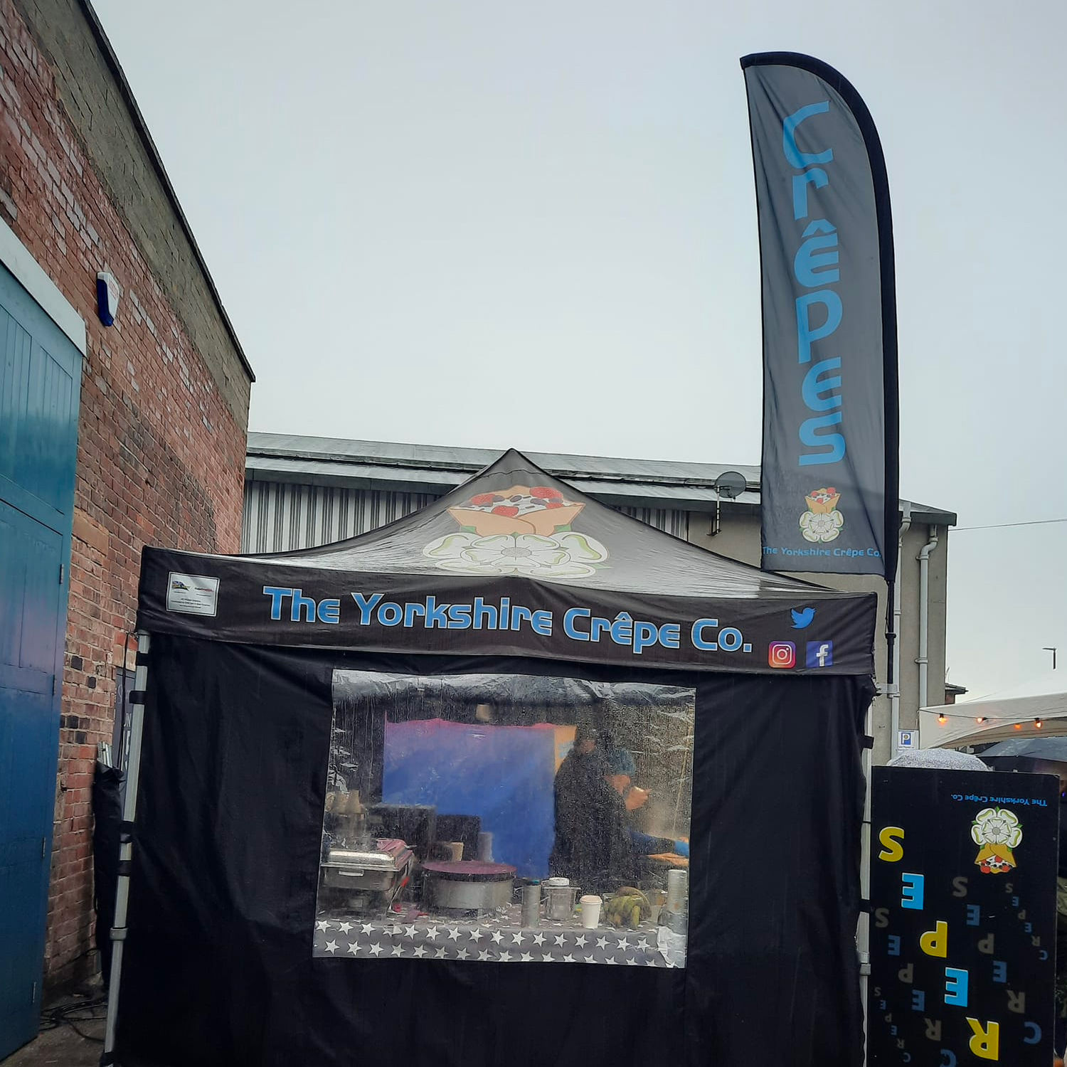
This is the single most important rule, and the one most often ignored. The top third of a sail flag is the only part guaranteed to be visible.

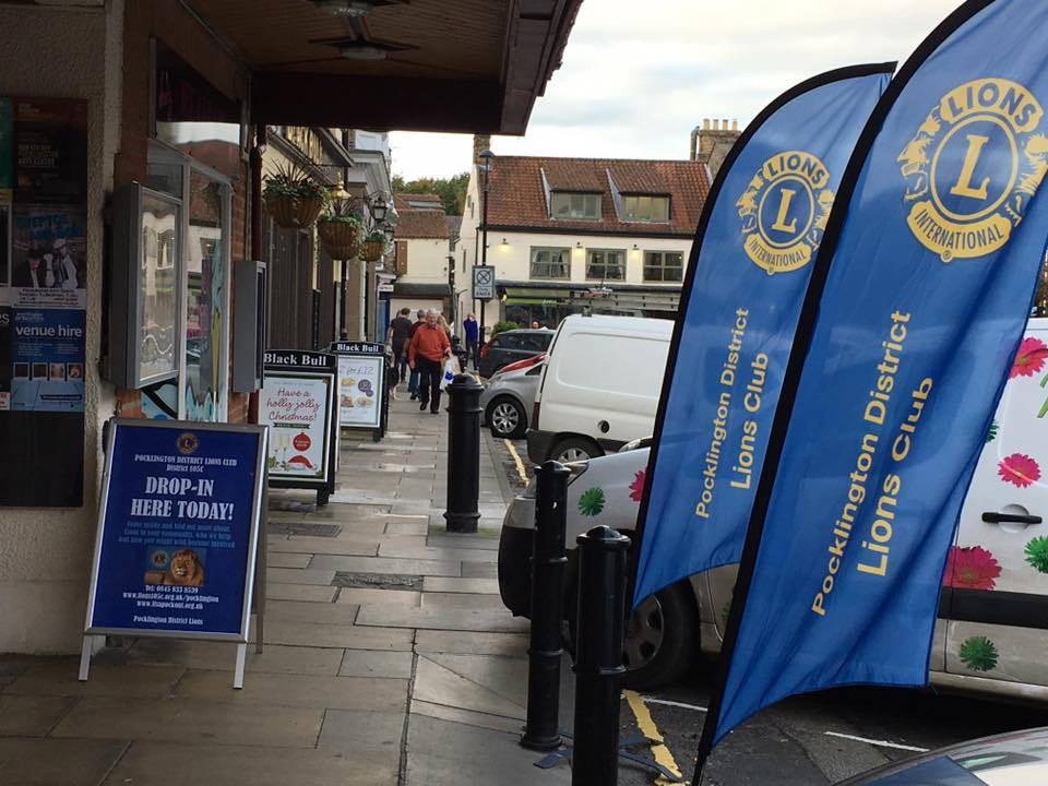
Everything below it gets blocked, by crowds, parked cars, tables, stalls, hedges, and the people standing at your own stand. At a busy event, the lower half of a flag might as well not exist.

So your logo goes at the top. Not centred, not at the bottom, and not spread evenly down the length. If someone can only see the top third of your flag over a crowd, they should still know exactly who you are.

Below that, the middle can carry a short supporting message. The bottom is best treated as colour and pattern rather than information.
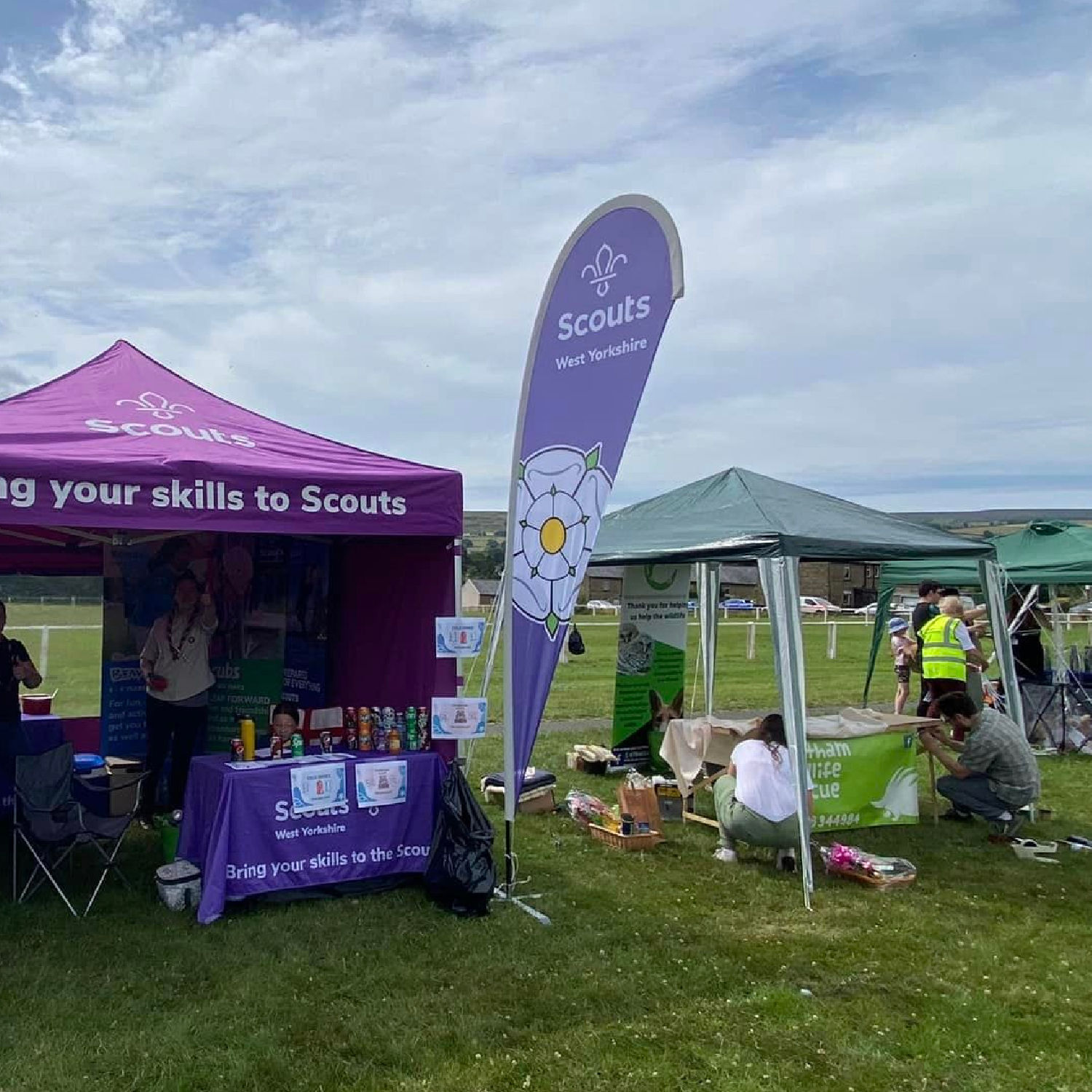
Give It One Message, Not Three

A flag is read in roughly a second by someone in motion. That is enough time for a logo and, at most, a handful of words.

Choose one thing you want the flag to say. Your name, or one offer, or one instruction like "Open" or "Park Here". Adding a second and third message does not double the communication, it halves the chance any of them lands.

If you have more to say, say it on something people stand still to read: a PVC banner, an upright outdoor banner at the entrance, or printed material at the stand. Flags pull people in, other products explain.

Work With the Narrow Shape

A sail flag is a tall portrait rectangle, and that shape suits some designs far better than others.

Stacked, centred elements work. A logo, a short line of text beneath, and a colour block behind reads cleanly. Wide horizontal logos are the awkward case, because forcing a landscape logo into a narrow portrait space either shrinks it to nothing or crops it. If your logo is wide, consider using a stacked or icon-only version of it on flags, and keep the full lockup for banners where the proportions suit.

Avoid running text vertically down the flag. It sounds like a neat use of the shape, and it is very hard to read at a glance while walking past.

Colour Carries Further Than Anything

At the distance flags are seen from, colour registers before shape and long before text. A bold, saturated brand colour running the full length of the flag makes it identifiable from across a car park, and identifiable is most of the job.

Strong contrast between your logo and the background is essential. Pale grey type on white, or navy on black, will disappear outdoors even at close range. If your brand palette is subtle, this is the product where you use its boldest colour rather than its most tasteful one.

The same colour should run across your gazebo, banners and barriers, so the flags read as part of one setup. Consistency is what turns a stall into a recognisable brand, as covered in the psychology behind colour in branding.

Decide Single or Double Sided

This is a design decision as much as a budget one.

Single-sided printing pushes the ink through the fabric, so the reverse shows a mirrored version of your artwork. It is vibrant, it is the lower-cost option, and it is completely fine when people only ever approach from one direction, or when your design is a logo and colour rather than text.

Double-sided uses a block-out liner between two printed layers, so the artwork reads correctly from both sides. It is the right choice when foot or road traffic passes on both sides, or when your flag carries words, since mirrored text is unreadable and looks like a mistake.

A practical rule: if the flag is mostly a symbol and a colour, single-sided is fine. If it says something, and people see it from both sides, pay for double.

Think About How Many You Are Running

A single flag identifies a spot. A row of matching flags creates a destination, and the effect is disproportionate to the cost.

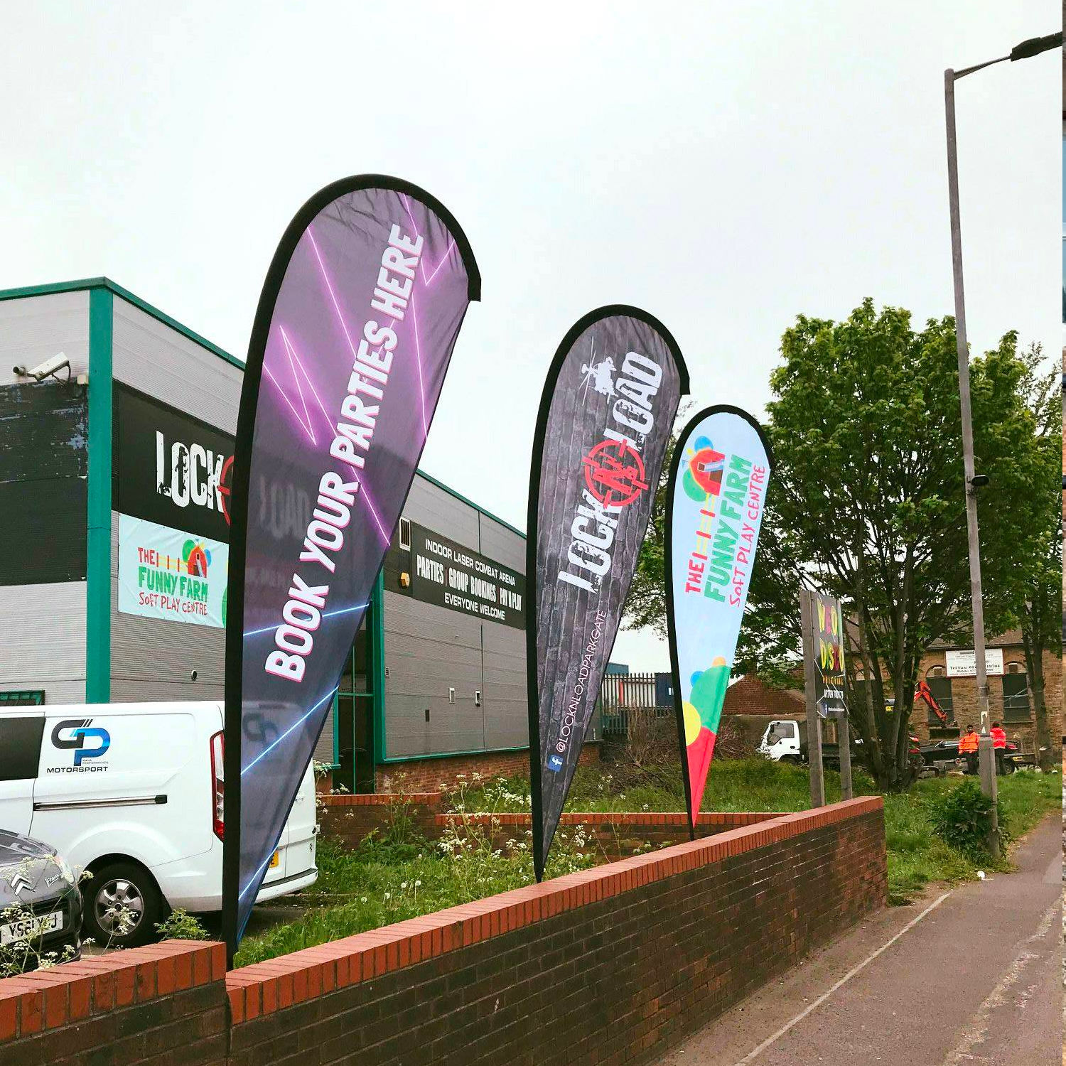
If you are ordering more than one, decide whether they should be identical or a set. Identical flags give the strongest recognition and read as a deliberate frontage. A varied set, each carrying a different message, can work along a longer approach, though it dilutes recognition and is usually the weaker choice unless you have a genuine reason.

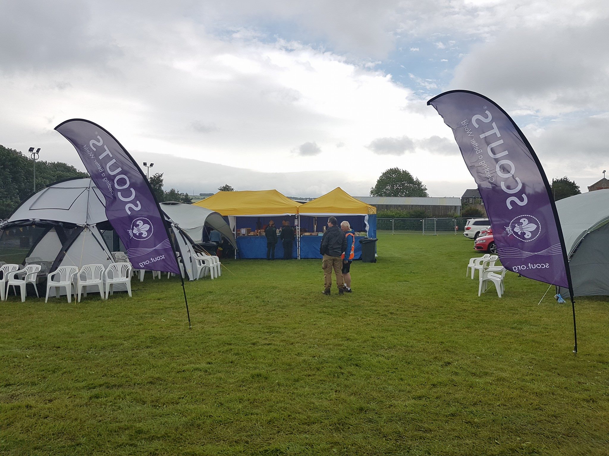
For most businesses, a matched pair either side of an entrance or a gazebo is the most effective arrangement.

Remember the Fabric Moves

A flag is never perfectly flat. It ripples, twists and folds, which is exactly why it catches the eye, and it does mean fine detail suffers.

Bold shapes hold their identity as the fabric moves. Thin outlines, small type and intricate illustration break up. Test your design by imagining it half-turned in a breeze: if it is still recognisable, it works.

Keep It Bold and Keep It Simple

An arch is usually seen outdoors, at distance, often in motion, sometimes in poor light. Strong shapes and confident colour do the work. Thin outlines, small text, and detailed illustration disappear.

A useful test: reduce the design to a thumbnail. If you can still identify whose arch it is, the design is strong enough. If it becomes a coloured blur, it needs simplifying. The same principle underpins why some brands are remembered after events.

Let the Design Team Help

Send your logo, brand colours and a note on where the flags are going and how people will approach them, and the in-house team will work up the layout and proof it before production. If your logo is landscape and needs adapting to the portrait format, say so and they will handle it.

If you want the product detail rather than the design thinking, our complete guide to flags for business covers sizes, poles and bases.

Frequently Asked Questions

Where should the logo go on a sail flag?
At the top. The lower part of a flag is regularly blocked by crowds, vehicles and stalls, so the top third is the only area guaranteed to be visible in a busy setting.
How much text should a sail flag have?
As little as possible. One message, read in about a second by someone walking past. Longer messages belong on banners or printed material people stand still to read.
Should I choose single or double-sided printing?
Single-sided shows a mirrored image on the reverse and suits designs based on a logo and colour. Choose double-sided when the flag carries words or when people pass on both sides.
My logo is wide. Will it work on a flag?
A landscape logo can be awkward in a tall narrow format. Using a stacked or icon-only version for flags usually works better, keeping the full logo for banners where the proportions suit.
Can Gala Graphics design the flag for me?
Yes. Send your logo, brand colours and details of the site, and the in-house design team will develop the layout and proof it with you before production.
Expert advice from Gala Graphics


Need Help?

Request a call back