Branded motorsport marquee with printed canopy and walls

Designing Café Barriers for Your Brand

Written by Jonathan Rodgers

Café barriers brand a boundary at eye level along a busy footpath, seen as a repeating run rather than a single sign. Here is how to design panels that read as one system, repeat cleanly, and still work when you add more.

Café barriers are a modular post-and-panel system, so you are not designing one sign, you are designing a run of panels that read together along the edge of your space. That repeating, side-by-side nature is what makes designing them different from designing a single banner. Here is how to approach it.

Explore Café Barriers Get Design Advice Download a Brochure

A barrier panel sits at roughly waist to chest height and runs along a path, so it is read by people walking past at close range, one panel after another. The design job is to make that sequence work as a whole, rather than treating each panel as a standalone poster.

Design the Run, Not the Single Panel

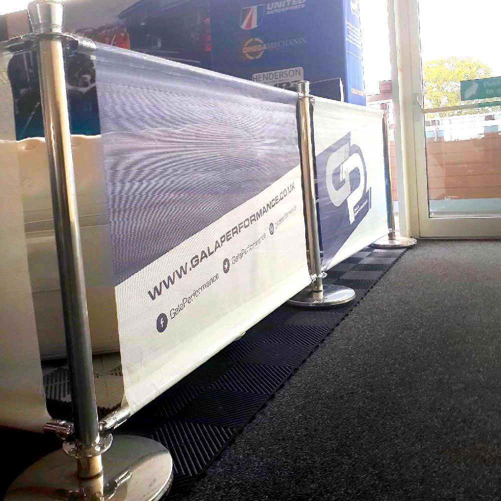
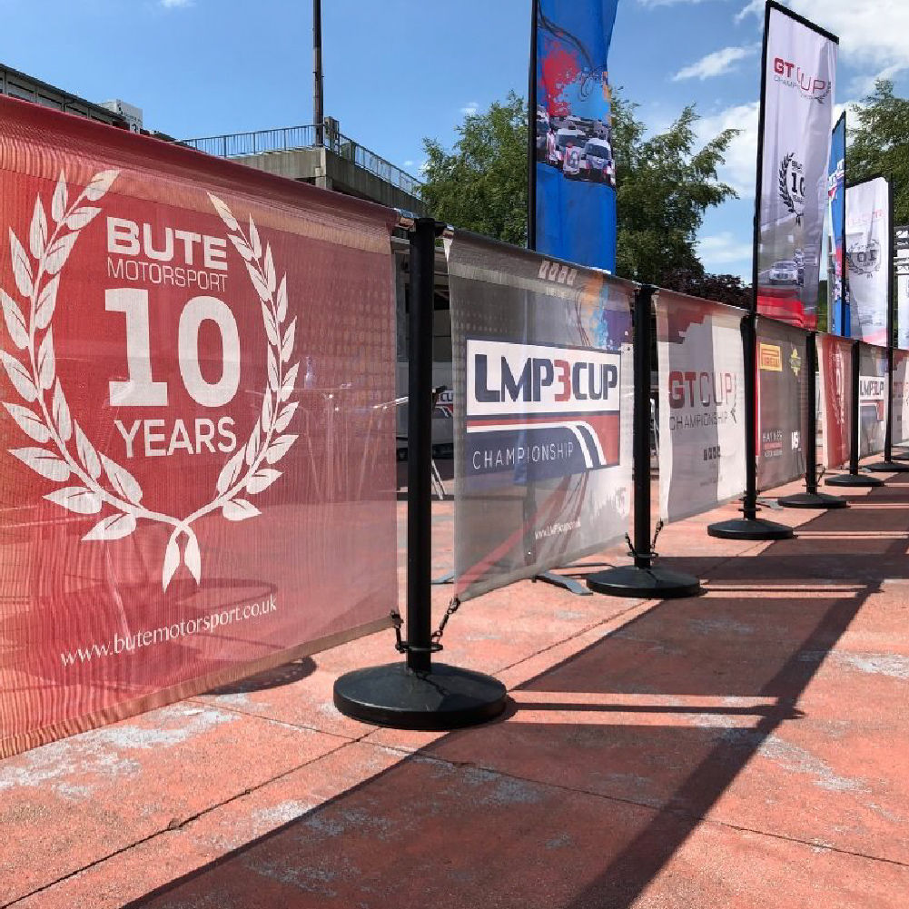
The most important shift in thinking is that people see your barriers as a line, not as one panel. As someone walks the length of your frontage, the panels pass by in sequence.

That gives you two broad approaches.

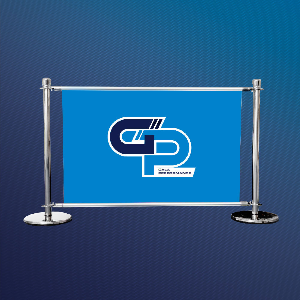
Repetition is the safest and usually the strongest. The same panel design repeated along the run reads as a clean, deliberate, branded boundary, and it means you can add or remove sections later without breaking the look. For most businesses this is the right choice.

A sequence, where panels carry different content that reads in order, can work for a longer run: a logo, then a strapline, then an offer, then contact details. It is more ambitious, it depends on people passing in the right direction, and it breaks if you reorder or extend the barriers. Use it only with a reason.

What tends to look messy is a random mix of unrelated panels. If they differ, they should differ on purpose.
Keep Each Panel Simple

Because barriers are read at close range but in passing, each panel should carry very little. One strong element per panel is the target: a logo, or a short message, or a single graphic device.

A barrier panel crammed with a logo, a paragraph, a phone number and a photograph becomes noise as someone walks past it in two seconds. If you have a lot to say, spread it across the run rather than loading it onto one panel, or put the detail on something people stand still to read.

Design for Eye Level and Below

Barriers sit lower than most signage, around waist to chest height, which changes where attention lands. People look slightly down at them, and the top edge of each panel is the most visible part.

Put your most important content in the upper portion of the panel, where it stays visible even when chairs, tables, planters or standing customers partly block the lower edge. In a busy seating area, the bottom of a barrier panel is frequently obscured, so treat it as the least valuable space.

Plan for a System That Grows

The barrier system is built from a master unit plus add-on sections, so your run can extend or shorten as your space changes. Your design should survive that.

This is the practical argument for a repeating design. If every panel is the same, the run looks intentional at any length, and adding two more sections next season costs you nothing in design terms. If you have built a one-off sequence that only reads at a specific length and in a specific order, extending it means rethinking the whole thing.

Design as though you might add more panels later, because most businesses do.

Match the Material to the Site, Then Design the Same

Barriers come in solid PVC or wind-permeable mesh. Mesh suits exposed and seafront positions where wind is a factor, solid PVC suits sheltered frontages and gives the boldest presence. Both take the same artwork, so a mixed run still matches.

For design, that means you do not design differently for mesh, you just lean, as always, toward bold shapes and strong colour, which reproduce well on either material and read best at the glancing distance barriers are seen from.

Make It Match the Frontage

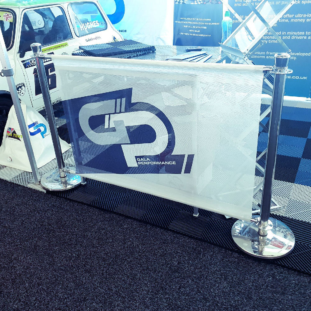
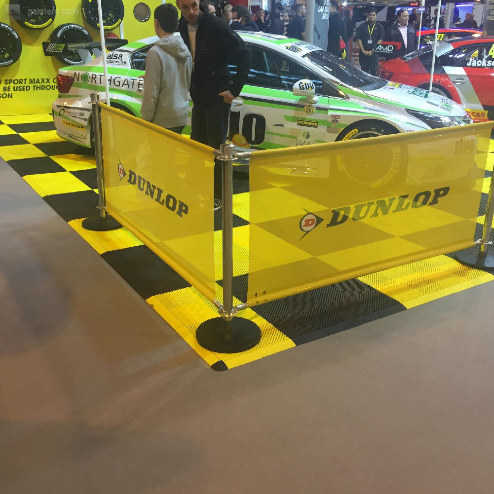
Barriers define the edge of a space that usually has other branding in it. If there is a printed gazebo, sail flags, or banners nearby, the barriers should share the same colour and logo treatment so the whole frontage reads as one setup.

For hospitality especially, the barriers often are the frontage, the first branded thing a passer-by sees at street level, so they carry more weight than their size suggests. Our guide to how café barriers help hospitality businesses covers that role in more detail.

Let the Design Team Help

Send your logo, brand colours, how many panels you are running and where they will stand, and the in-house team will design the panel, show you how it repeats along the run, and proof it before production. Tell them if you expect to extend the barriers later, so the design is built to grow.

Frequently Asked Questions

Should all my café barrier panels have the same design?
Usually yes. A repeating panel reads as a clean, deliberate branded boundary and lets you add or remove sections later without breaking the look. Different panels should only differ for a clear reason.
Where should the content sit on a barrier panel?
In the upper portion. Barriers sit low, and the bottom of each panel is often blocked by chairs, tables and standing customers, so keep the logo and message near the top.
How much can I put on one panel?
Very little. Barriers are read in passing, so one strong element per panel works best. Spread more content across the run rather than loading one panel.
Does the design change for mesh barriers?
No. Mesh and PVC take the same artwork. Mesh suits windy and exposed sites; both read best with bold shapes and strong colour.
Expert advice from Gala Graphics


Need Help?

Request a call back