Custom printed wallpaper is the largest thing you will ever put your brand on, and it is also the most permanent and the most closely inspected. People stand right next to it, and they live with it for years. That combination makes designing a feature wall a different exercise from designing a banner or a display. Here is how to approach it.
Explore Printed Wallpaper Get Design Advice Download a Brochure
Most branded products are glanced at from a distance. Wallpaper is the opposite: it is viewed from across the room and from an arm's length, it is a permanent part of an interior, and it covers a huge area. The design has to hold up at both scales and earn its place on the wall for the long term.


Decide What the Wall Is For
A branded wall can do very different jobs, and the design depends on which one.
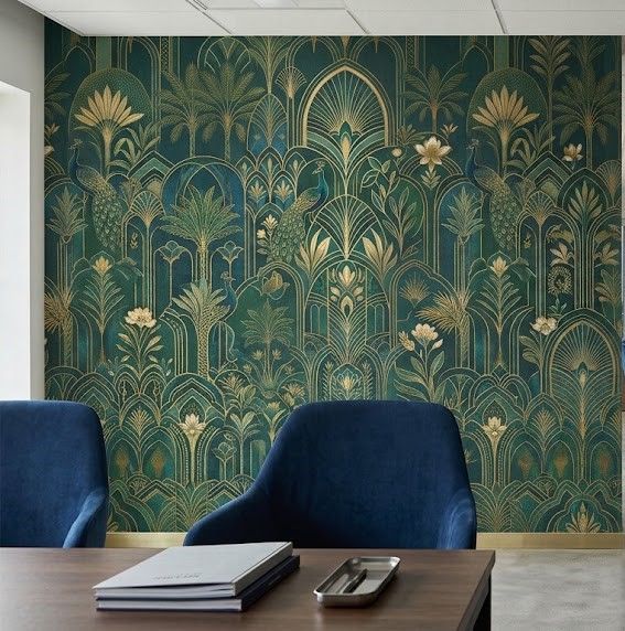
A statement feature wall is there to make an impression, in a reception, a restaurant, a hotel. It usually wants an image, a pattern, or an atmosphere rather than a big logo, and it works as design first and branding second.
A brand wall is there to reinforce identity, in an office, a showroom, a meeting room. This is where a logo, brand colours or a values statement belong, though even here, restraint reads better than a wall-sized logo.
A themed or storytelling wall carries content, product imagery, a company history, a mural that means something to the space.
Establish which of these you are making, because a subtle textured brand pattern and a bold photographic mural are designed completely differently.
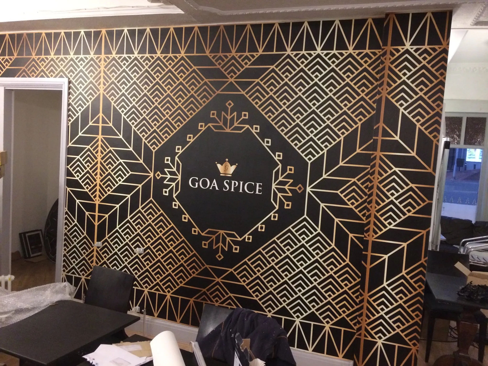
Design for Two Viewing Distances at Once
This is the challenge unique to wallpaper: it is seen both from across the room and from right up close, and it has to work at both.
From a distance, the wall reads as a whole, its overall composition, colour and impact. Up close, people see the detail, the resolution, the texture. A design that looks striking across the room but falls apart into blur at arm's length disappoints exactly where people spend the most time, standing next to it.
So the artwork needs to hold up at full wall scale, which is a far larger reproduction than most files are prepared for. This is the one product where image quality genuinely cannot be compromised, because there is nowhere for softness to hide on a wall someone leans against.
Understand It Prints in Vertical Strips
The practical constraint that shapes wallpaper design: it is supplied in 750mm-wide vertical strips, hung side by side and cut to your wall height. That has real design consequences.
Any design that runs horizontally across the wall, a continuous image, a panoramic scene, a pattern, has to line up across those vertical seams. A well-prepared design accounts for this and the strips align cleanly. It also means precise alignment matters at installation, which is why complex artwork that has to match across strips is worth having hung by a professional decorator rather than attempted freehand.
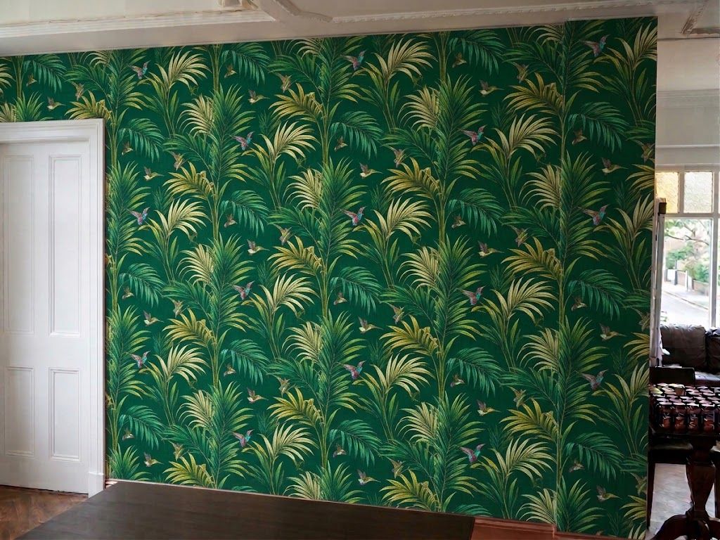
Simpler designs sidestep the issue: a textured background, a colour wash, or a repeating pattern is forgiving across seams, where a single large photograph with critical detail at the join is less so.
Design for the Texture
The wallpaper is a textured textile, not a glossy flat sheet, which gives it a soft, premium, non-gloss finish. That surface suits some designs better than others.
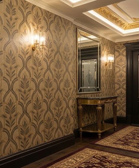
Rich colour, photography and painterly imagery look beautiful on it and benefit from the fabric quality. Very fine, crisp, hard-edged graphics, tiny type or precise technical lines are less suited to a textile surface than to a smooth one. If your design leans on very fine detail, it is worth discussing with the design team whether it will read as intended on the material.


Plan Around What Sits In Front of the Wall
A wall is rarely empty. Furniture, a reception desk, shelving, seating, screens and signage all sit in front of it and block parts of it.
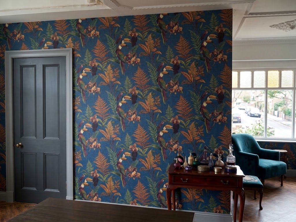
Before finalising the design, think about what stands where. Keep your most important element, a logo, a focal point, the part of an image you most want seen, in the area that stays clear, usually the upper portion of the wall above furniture height. Putting the key content low, behind where a sofa or a desk will sit, wastes it. Design around the real room, not an empty rectangle.
Design It to Last
Wallpaper is effectively permanent. It is not a campaign piece you swap out next season, it is part of the interior for years. That should steer you toward your settled, timeless brand identity rather than a current promotion or a trend.
Dated references, specific offers, and short-term campaign styling all belong on something temporary like a floor sticker or a roller banner. The wall should still look right in five years.
Match It to the Rest of the Space
A feature wall sets the tone for a room, and the rest of the interior branding should agree with it. Your logo mat at the entrance, your signage, and any roller banners or displays should share the wall's colours and identity, so the space reads as one considered environment rather than a wall that does its own thing. Our guide to custom printed wallpaper for business branding covers how businesses use it across a space.
Let the Design Team Help
Wallpaper is the product where design support matters most, because the scale, the strips and the permanence leave the least room for error. Send your artwork or concept, your brand colours, and your exact wall measurements, and the in-house team will scale the design to the wall, set it up to align across the strips, check it holds at full size, and proof it before anything is produced. If you have an idea rather than finished artwork, they can work it up with you.