Designing indoor display banners and stands

Designing Indoor Display Banners and Stands for Your Brand

Written by Jonathan Rodgers

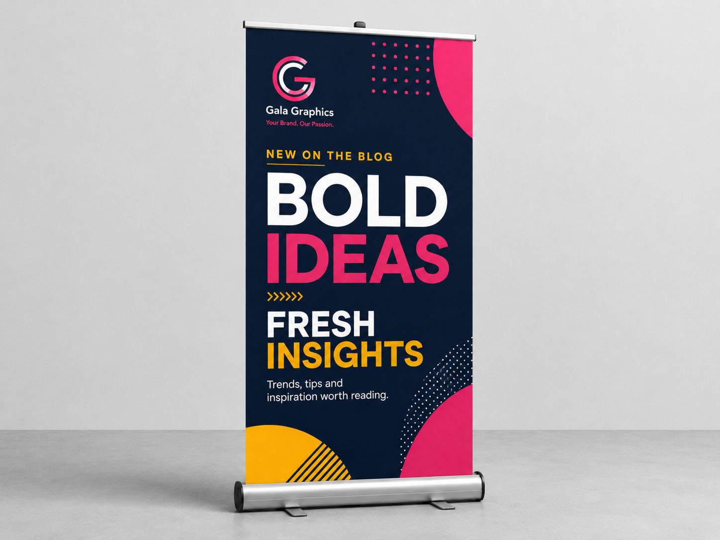
Roller banners, X banners and greeter stands share almost all the same design rules, so this one guide covers all three. Here is how to design your indoor displays for your brand, read top-down at standing eye level in a busy room.

This guide covers three products together, because they are designed in almost exactly the same way: the roller banner, the X banner, and the greeter stand. All three are tall, portrait indoor displays read by a standing person at close-to-medium range, and the design thinking that works for one works for all of them. Where a product needs something specific, this guide says so.

Explore Roller Banners Explore X Banners Explore Greeter Stands

A roller banner pulls up out of an aluminium cassette. An X banner tensions across a lightweight frame. A greeter stand is a branded stand you work behind. They do slightly different jobs, but visually they are all upright branded surfaces seen indoors at standing height, so the same layout principles apply across the set. Design one well and you can design all three.

The One Rule That Matters Most: Design Top-Down

Indoor displays live in crowded rooms. At an exhibition, a conference or a busy reception, the bottom half of any floor-standing display is blocked by people, tables and other stands. The top is what everyone sees.

So design from the top down, in three bands:

  • Top third: your logo and the single most important thing you want understood. This is the only part reliably visible over a crowd, so it has to carry your identity on its own.
  • Middle third: your supporting message, read by people who have come closer. This is where a short line about what you do or what you are offering belongs.
  • Bottom third: contact details, a website, a QR code, or simply colour. Assume it is often blocked, so nothing critical goes here alone.

This single principle fixes most weak indoor displays, which typically centre everything and lose half of it behind the crowd.

Keep It to One Clear Message

A person glances at a display for a second or two as they pass, or takes it in while deciding whether to approach your stand. That is not enough time for dense information.

Decide the one thing each display should communicate and build around it. If you need to say more, that is an argument for more than one display, each with its own message, rather than one crowded banner. Two clean banners outperform one busy one every time.

Design for the Portrait Shape

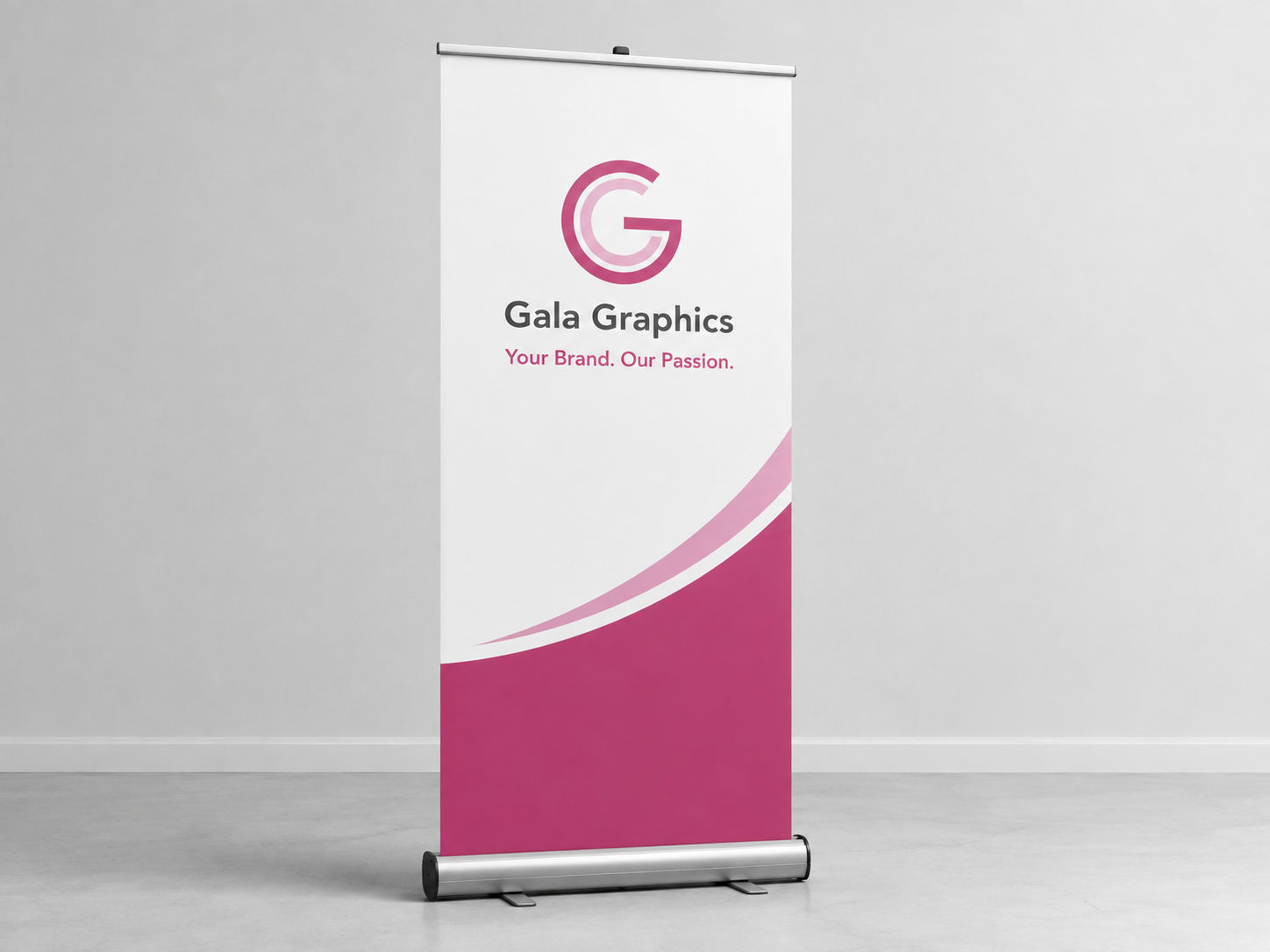
All three products are tall and narrow, which suits stacked, centred layouts: logo at the top, message below, supporting detail beneath that. Wide landscape logos are the awkward case, as they either shrink to fit the narrow width or leave large gaps. If your logo is landscape, a stacked or icon version usually works better on these formats.

Avoid sideways or vertical text. It looks like a neat use of a tall shape and is genuinely hard to read while walking past.

Contrast and Simplicity Carry the Room

Indoor lighting is variable and displays are often seen against busy backgrounds of other stands. Strong contrast between text and background keeps a display readable in those conditions. Pale text on white, or low-contrast tones, disappear in a crowded hall.

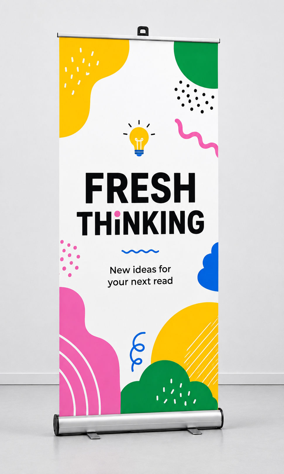
Bold, simple design also photographs better, which matters because indoor displays end up in the background of stand photos and social posts. A clean layout with a clear logo reads even in a busy background shot.

What's Specific to Each Product

The rules above cover all three. These are the few things that differ.

Roller banners are your main, most stable display, the one you take to event after event. Because the graphic retracts into its cassette and can be reprinted separately, it is worth designing as your primary, most polished piece. If you are only doing one indoor display well, make it this.

X banners are lighter and cheaper, and people usually own several. That makes them ideal for a set: matching X banners marking the edges of a stand, or several carrying different single messages. Design them as a coordinated group rather than as one-offs, since their strength is in numbers.

Greeter stands are the one that differs most. The design wraps around the front and both visible sides rather than sitting on one flat face, so your artwork has to work across the front and the returns, not just as a single panel. Keep the strongest branding on the front where people face it, and carry the colour and logo round the sides so it still reads when the stand is seen at an angle. Remember too that things sit on the top surface, a tablet, brochures, a card reader, so the usable branded area is the front face rather than the top.
Design Them as a Set

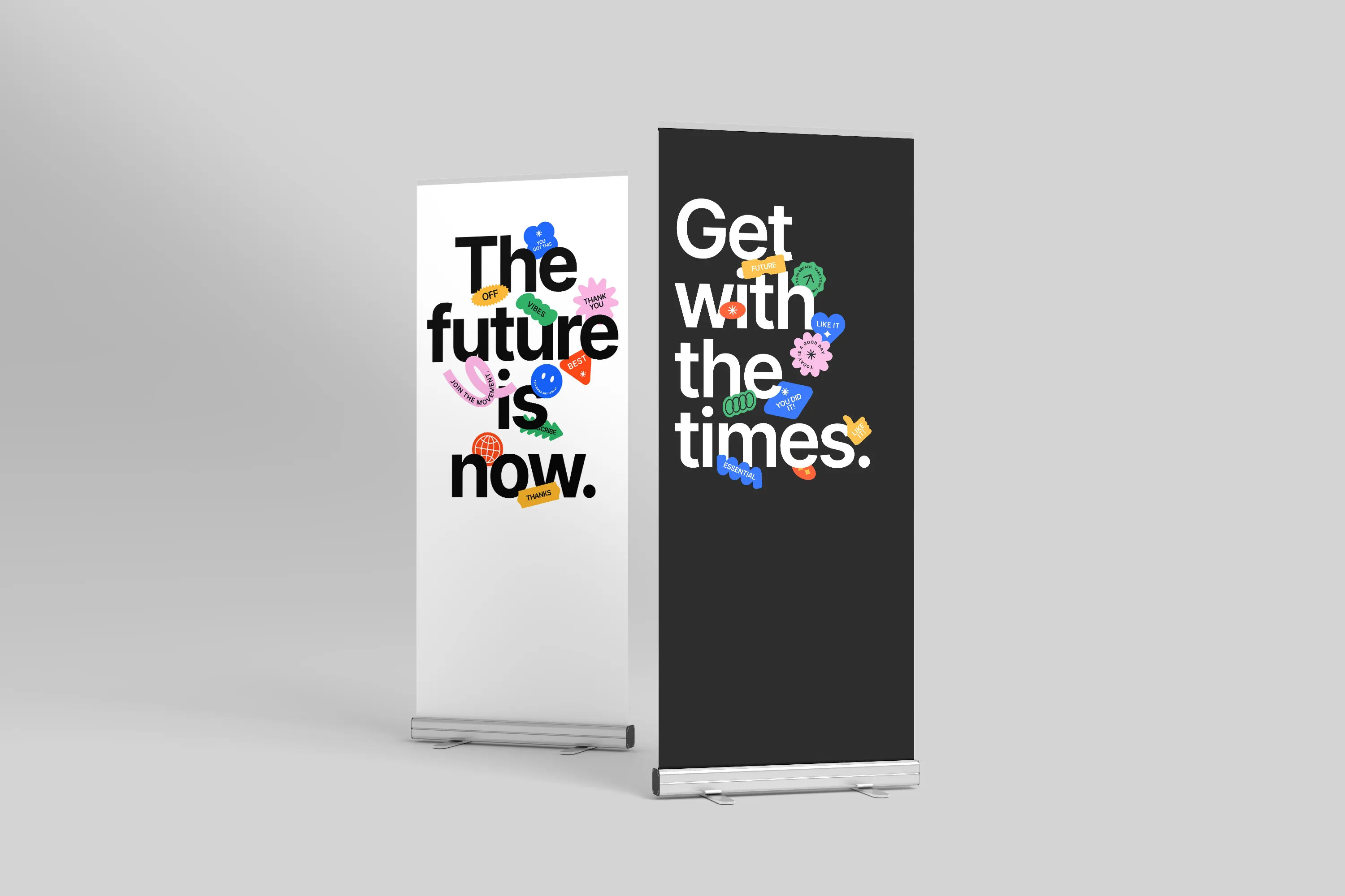
Most indoor setups use more than one of these together: a roller banner as a backdrop, a greeter stand at the front, X banners at the edges. They should all look like one identity, same colour, same logo treatment, same tone.

Decide what each piece says so they complement rather than repeat each other. The roller banner might carry who you are and what you do, the greeter stand your logo and a welcome, an X banner a specific offer. Together they should tell one coherent story across the stand, which is the approach in our guide to what to put on your exhibition stand.

Let the Design Team Help

Send your logo, brand colours, and a note on which of the three you are ordering and how they will be used together. The in-house team will lay each one out top-down, adapt a landscape logo to the portrait format if needed, handle the wraparound for a greeter stand, and proof everything before production.

For the product detail rather than the design thinking, the roller banner, X banner and greeter stand pages cover sizes and how each works, and our guide to building a portable display kit shows how they combine.

Frequently Asked Questions

Do roller banners, X banners and greeter stands use the same design rules?
Largely yes. All three are tall indoor displays read at standing height, so the top-down layout and one-message approach apply to all of them. A greeter stand differs in that the design wraps around the front and sides.
Why should I design an indoor display top-down?
Because the bottom half is blocked by people and tables in a busy room. The top third is the only part reliably visible over a crowd, so your logo and key message belong there.
What's different about designing a greeter stand?
The design wraps around the front and both sides rather than a single flat panel. Keep the strongest branding on the front, carry colour round the sides, and remember the top surface holds equipment rather than branding.
Should X banners match each other?
Usually yes. X banners are often bought in multiples, and a matching set reads as a deliberate, coordinated display. Design them as a group rather than as separate one-offs.
Expert advice from Gala Graphics


Good Morning, how can I assist you today?

Assistance
ExpandAssistance   Alexandria